Key Art

Theatrical graphics
[Current]
A showcase of small image in work content


“I love this poster.”

— Whitney White

DIRECTOR & TWO-TIME TONY AWARD NOMINEE

“This is incredible! This might be my favorite. I’m so excited.”

—York Walker

AWARD-WINNING PLAYWRIGHT

I’ve been creating key art for theatre companies across the nation since 1995. It’s been a joy to follow in the footsteps of show art designers I've always idolized: James McMullan, Gilbert Lesser, David Byrd, Frank Verlizzo, and not-always-theatrical design greats like Edward Gorey, David Lance Goines, Herb Lubalin, and Milton Glaser. 

A dedicated image thumbnail for client project

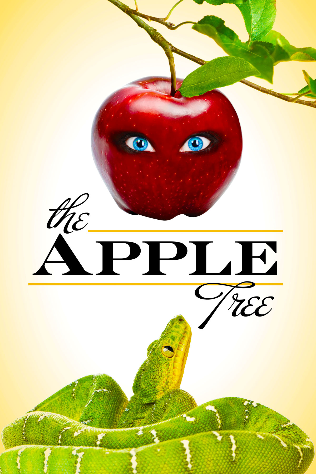
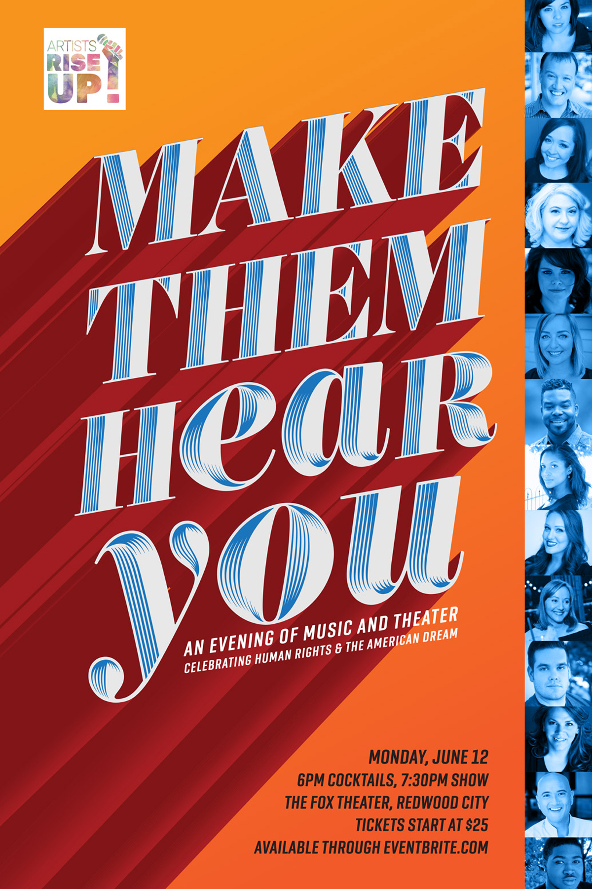
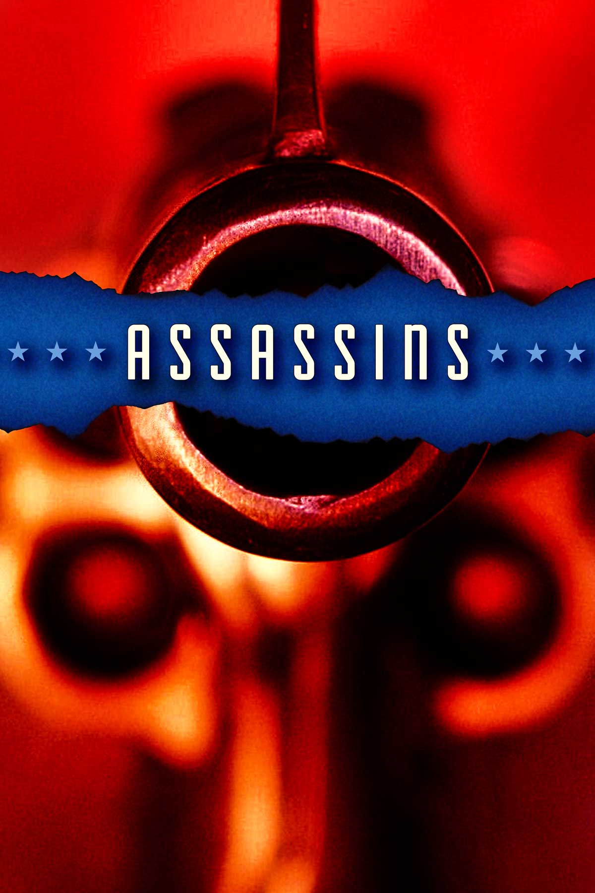
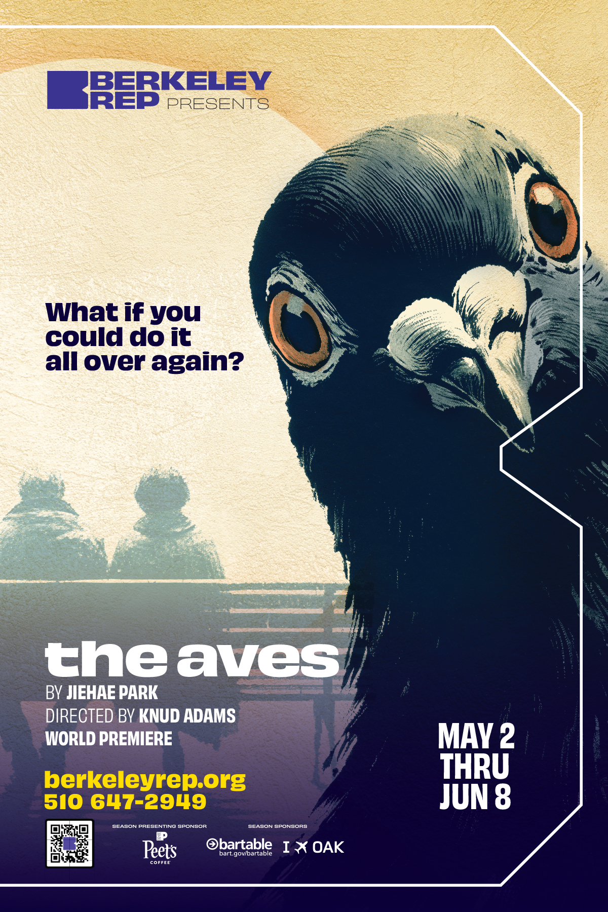
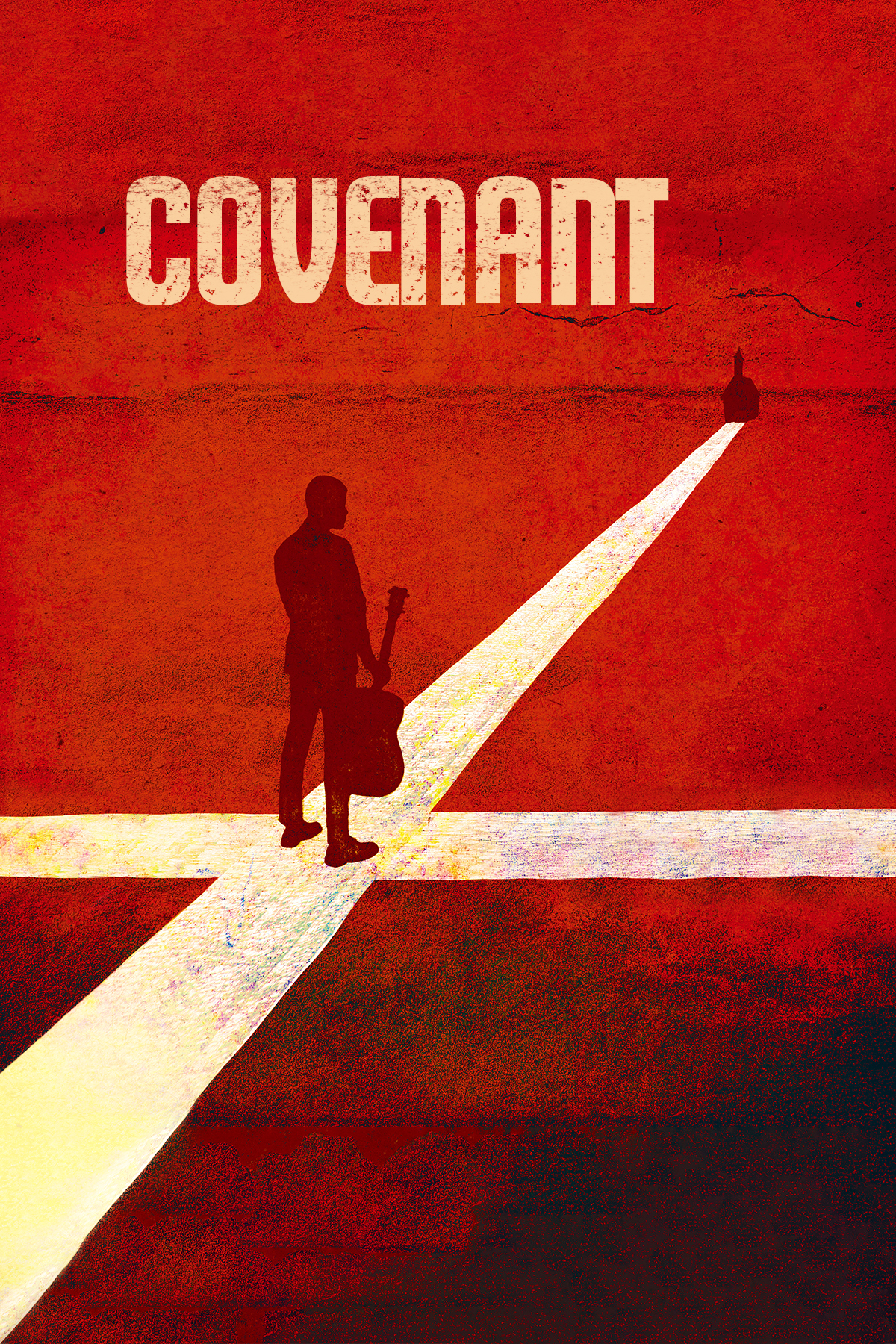
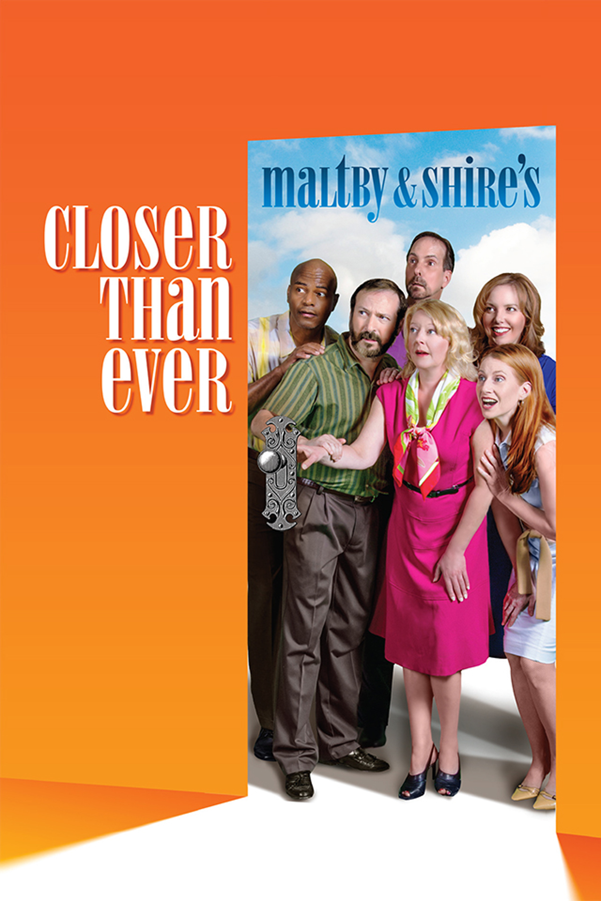
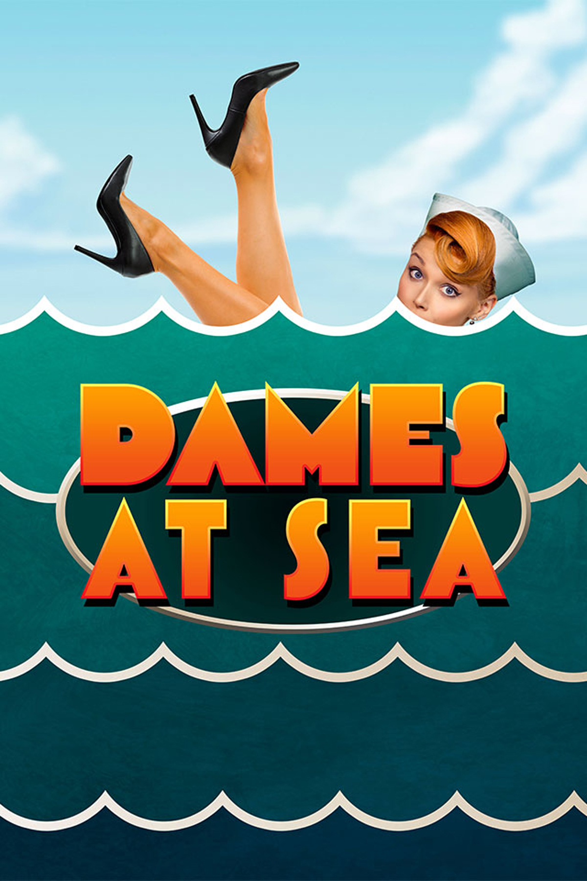
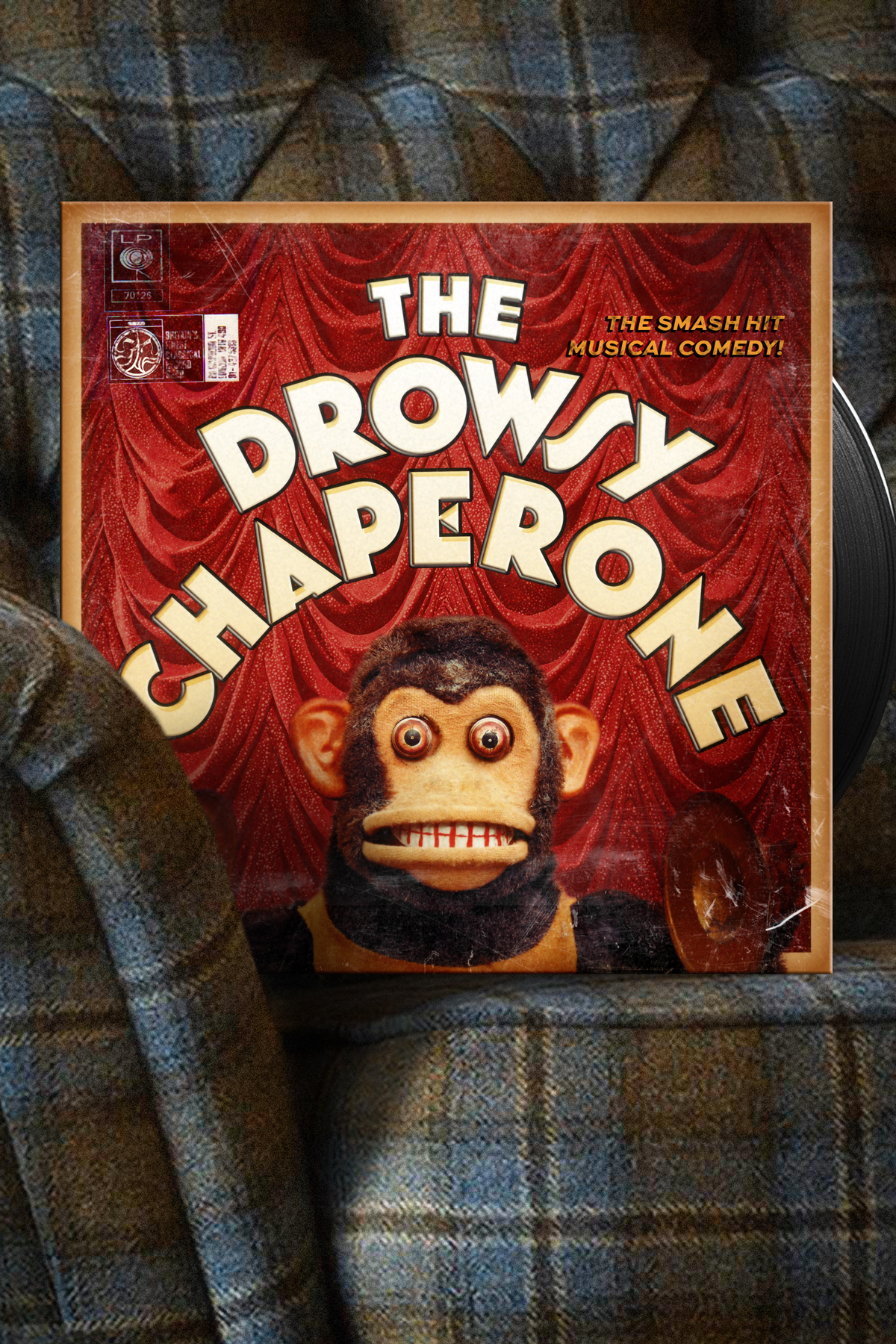
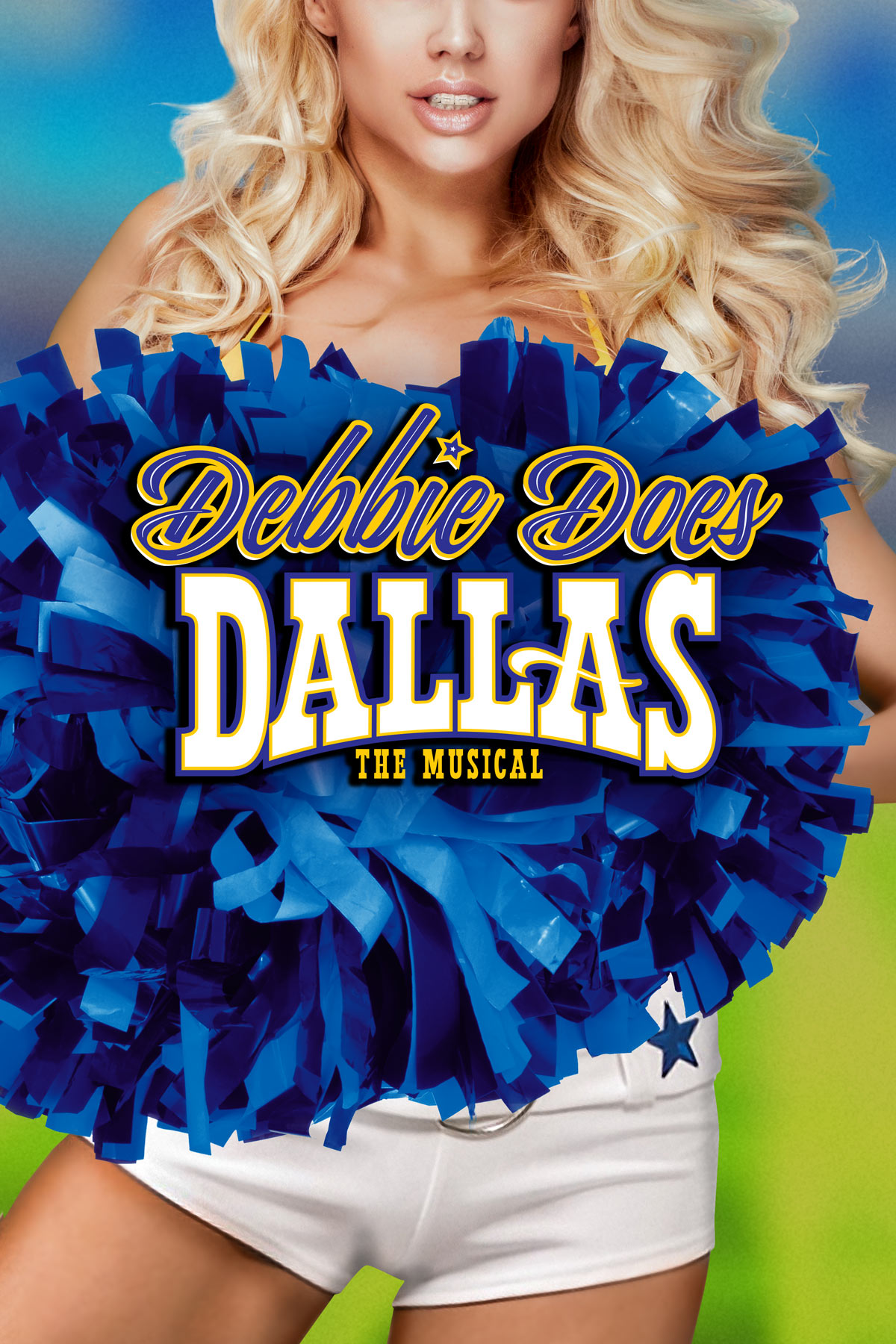
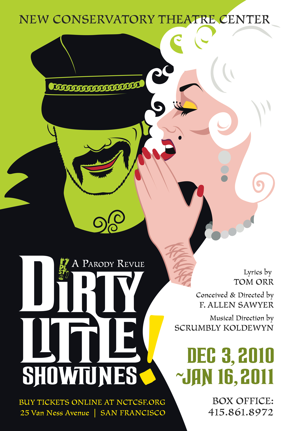
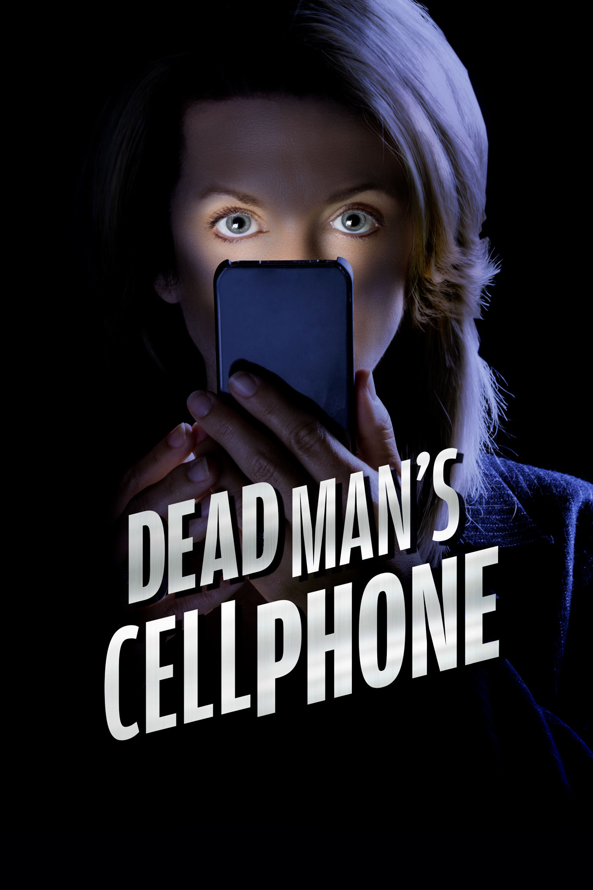
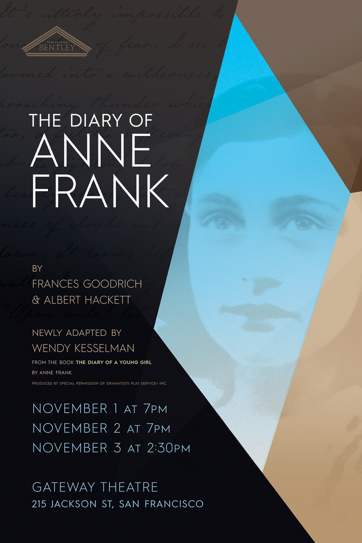
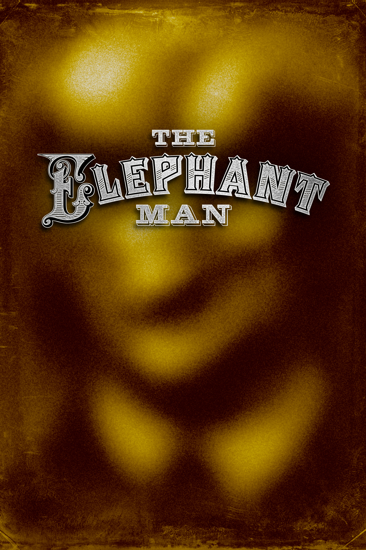
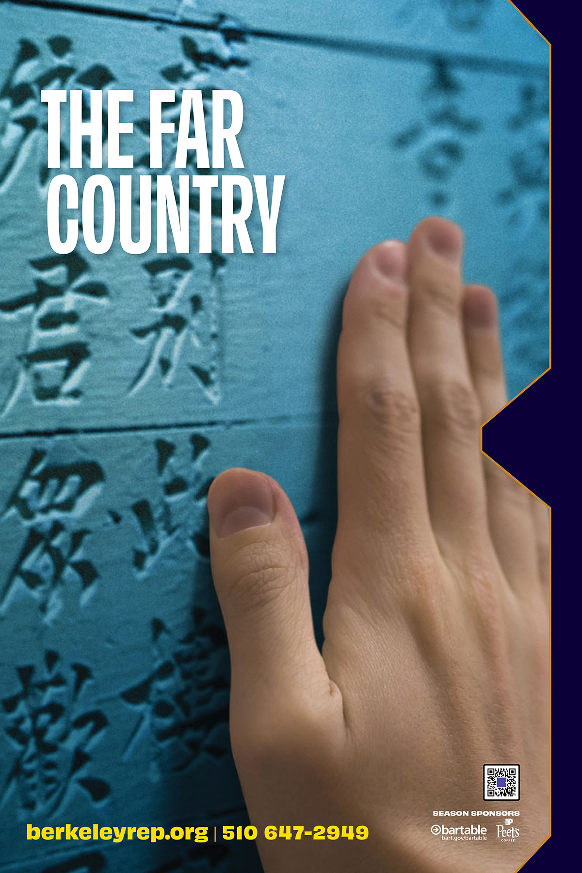
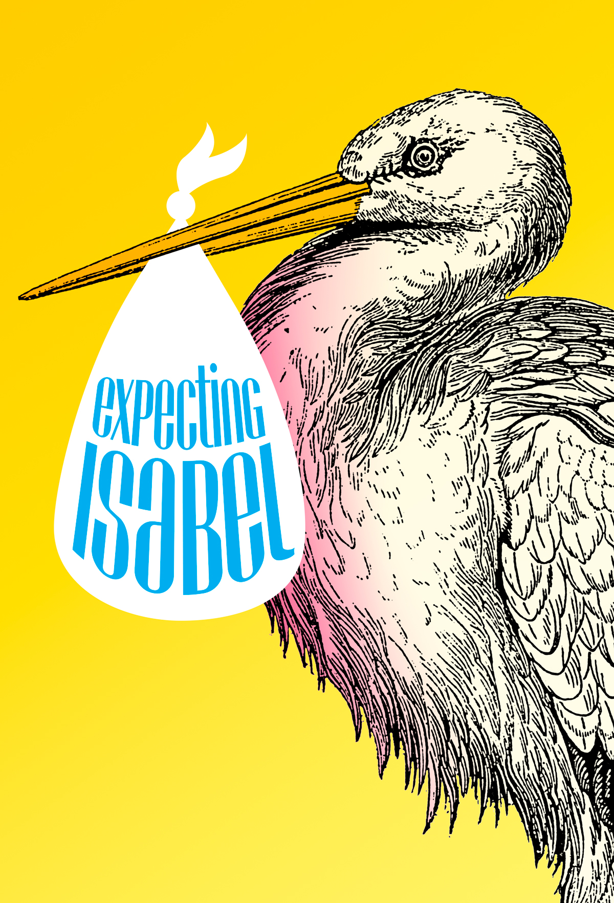
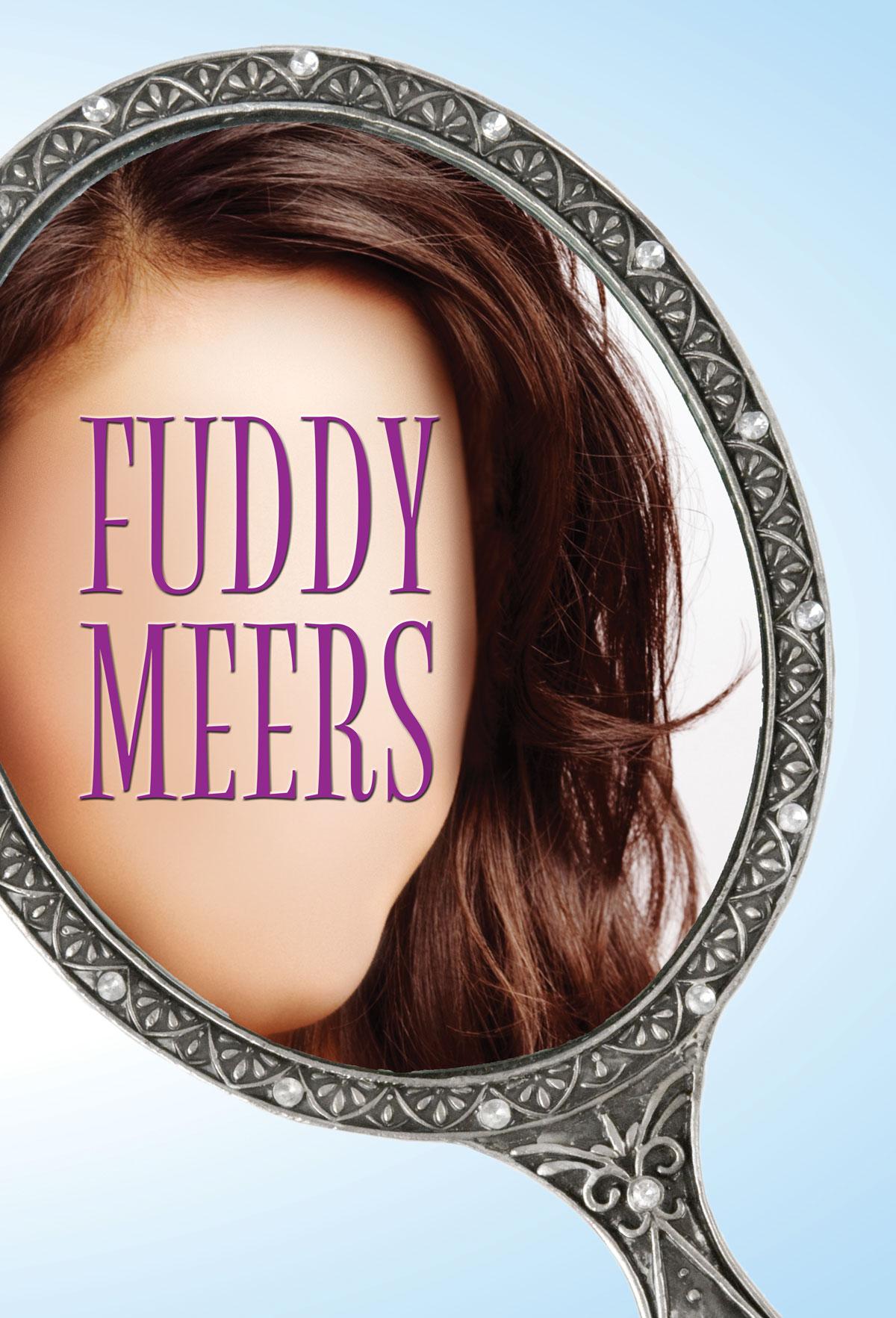
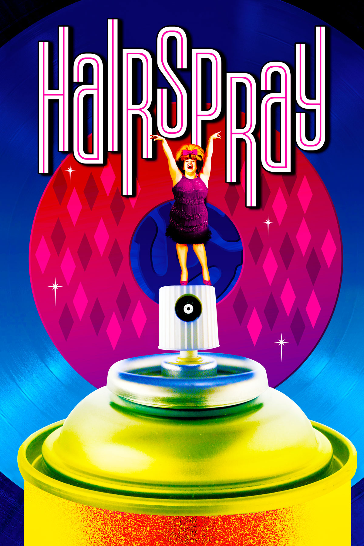
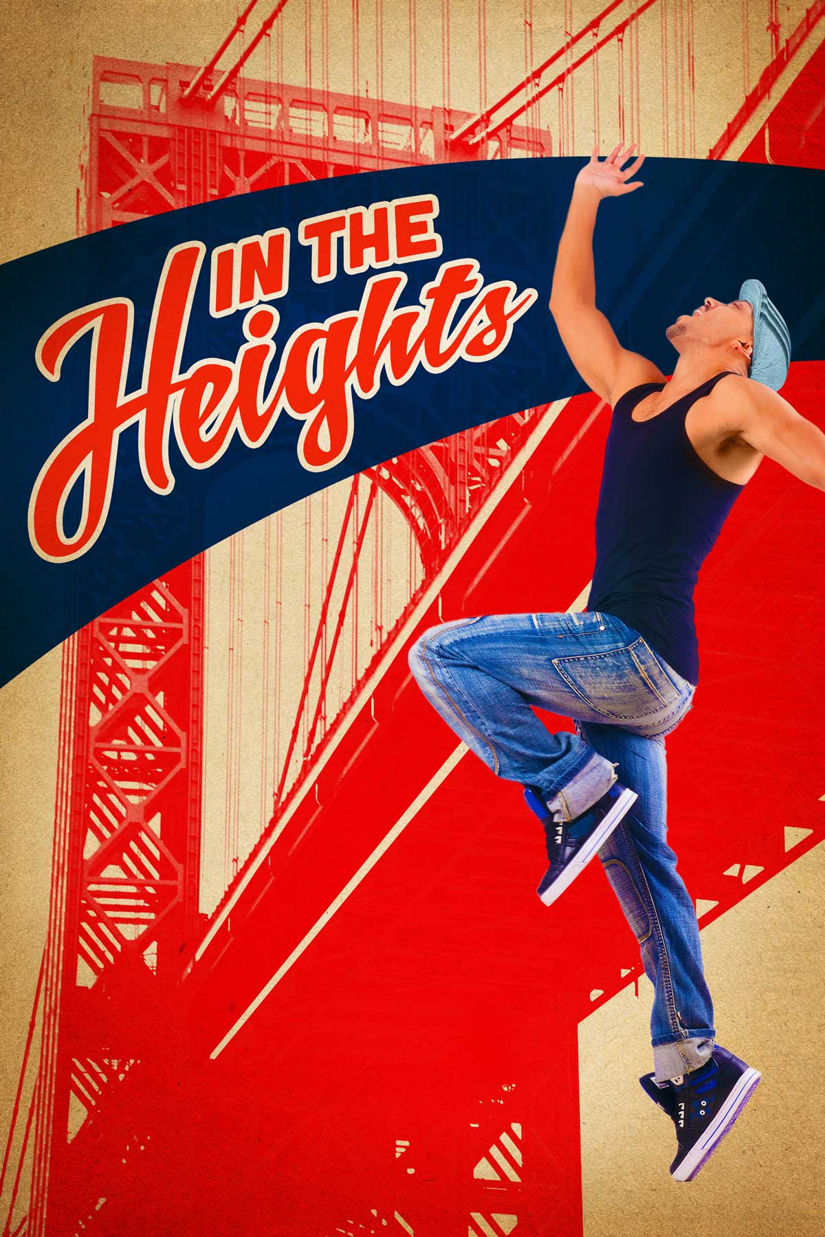
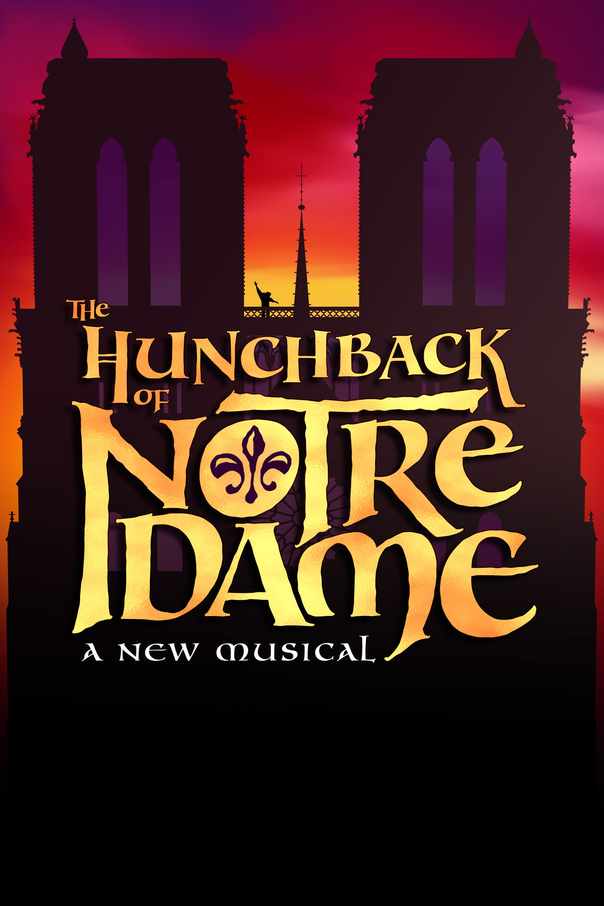
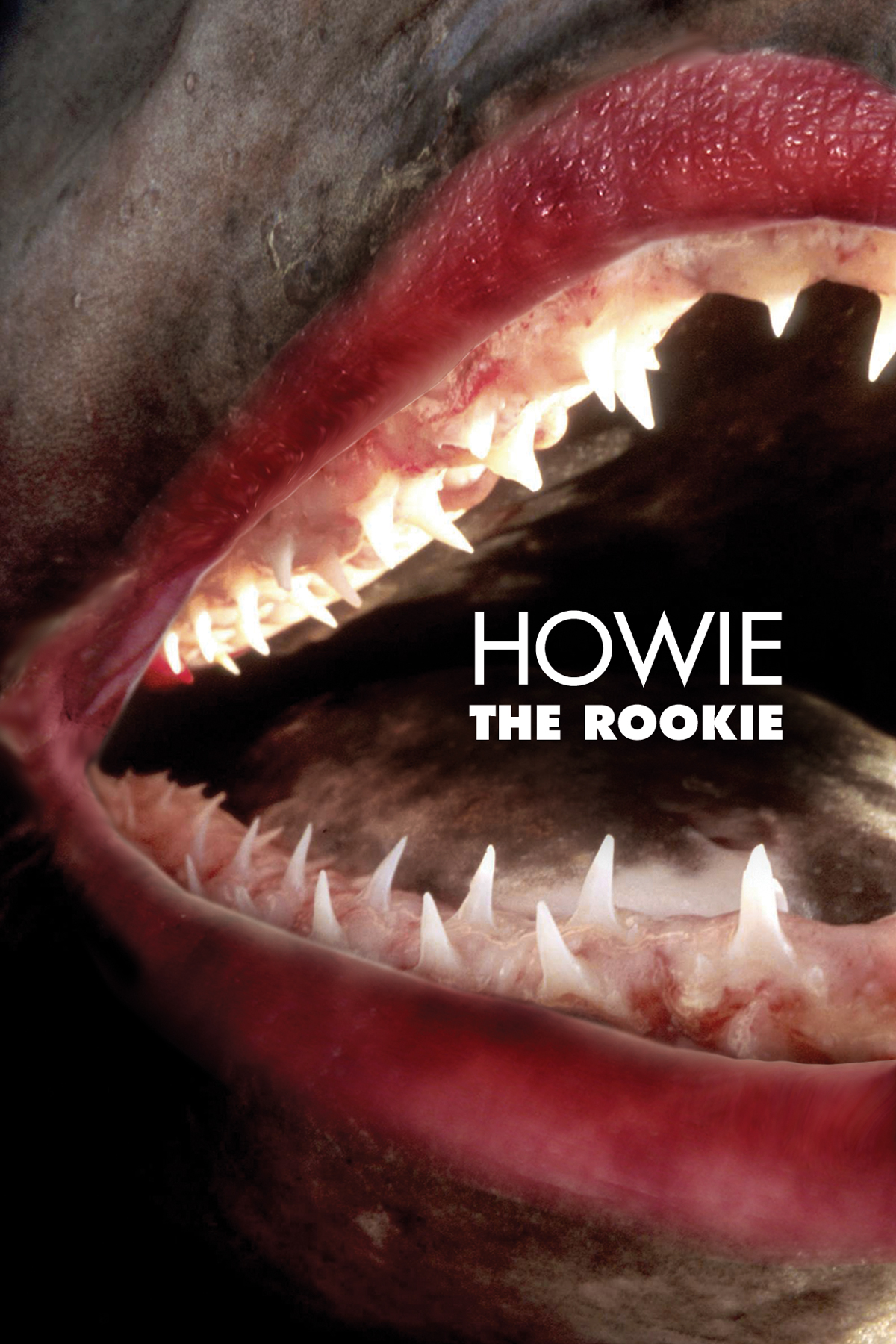
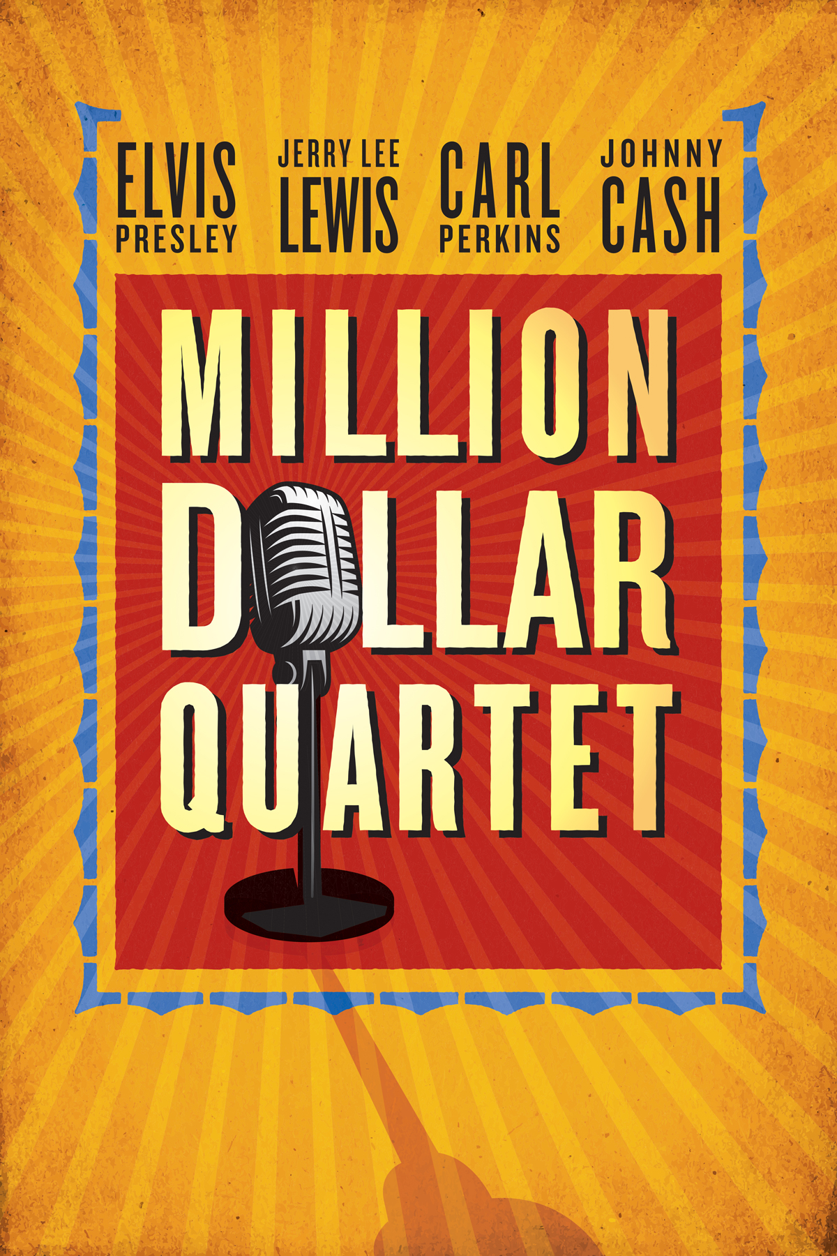
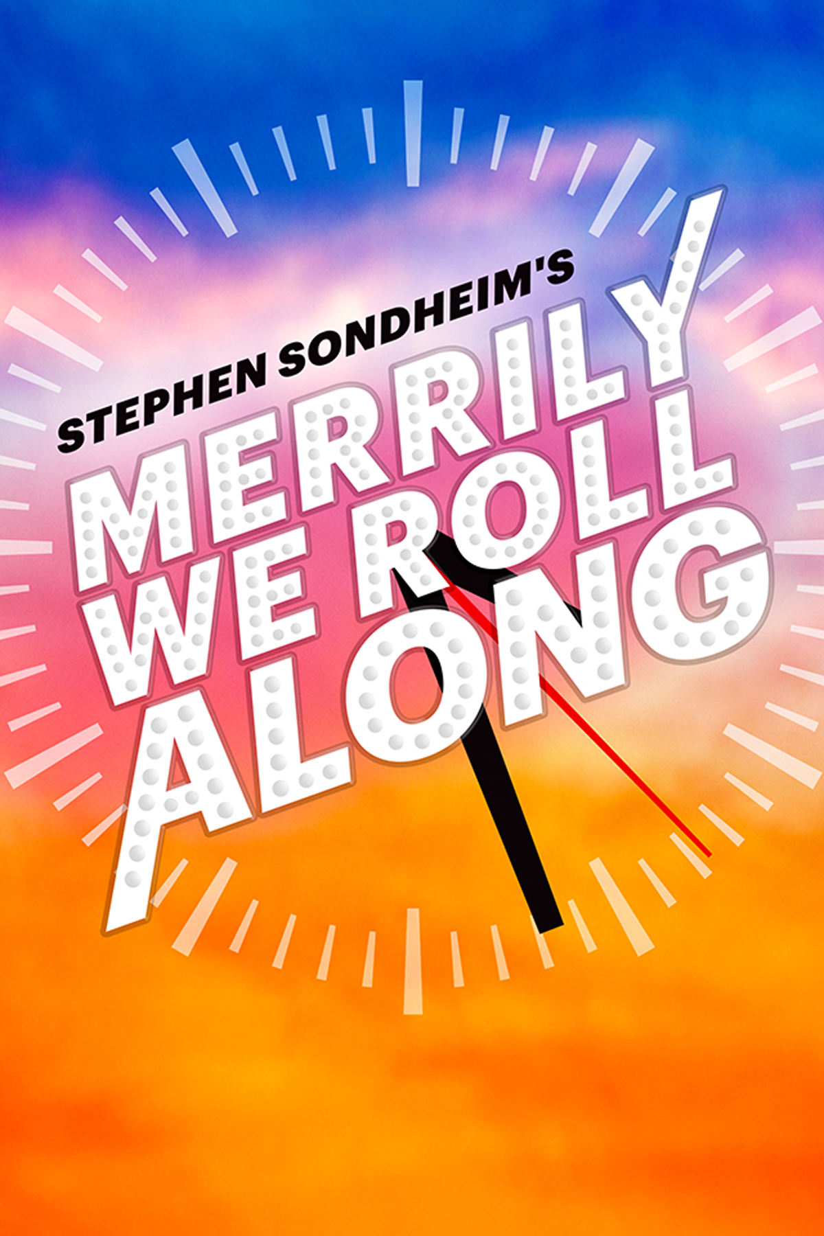
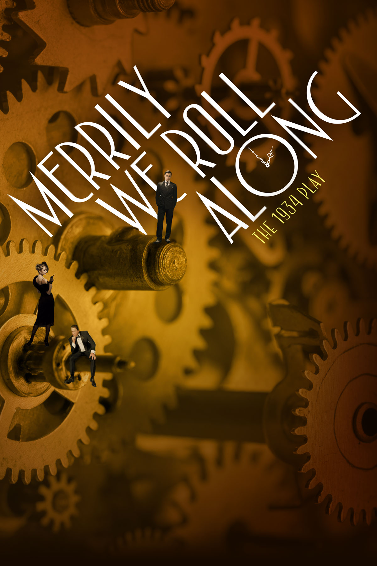
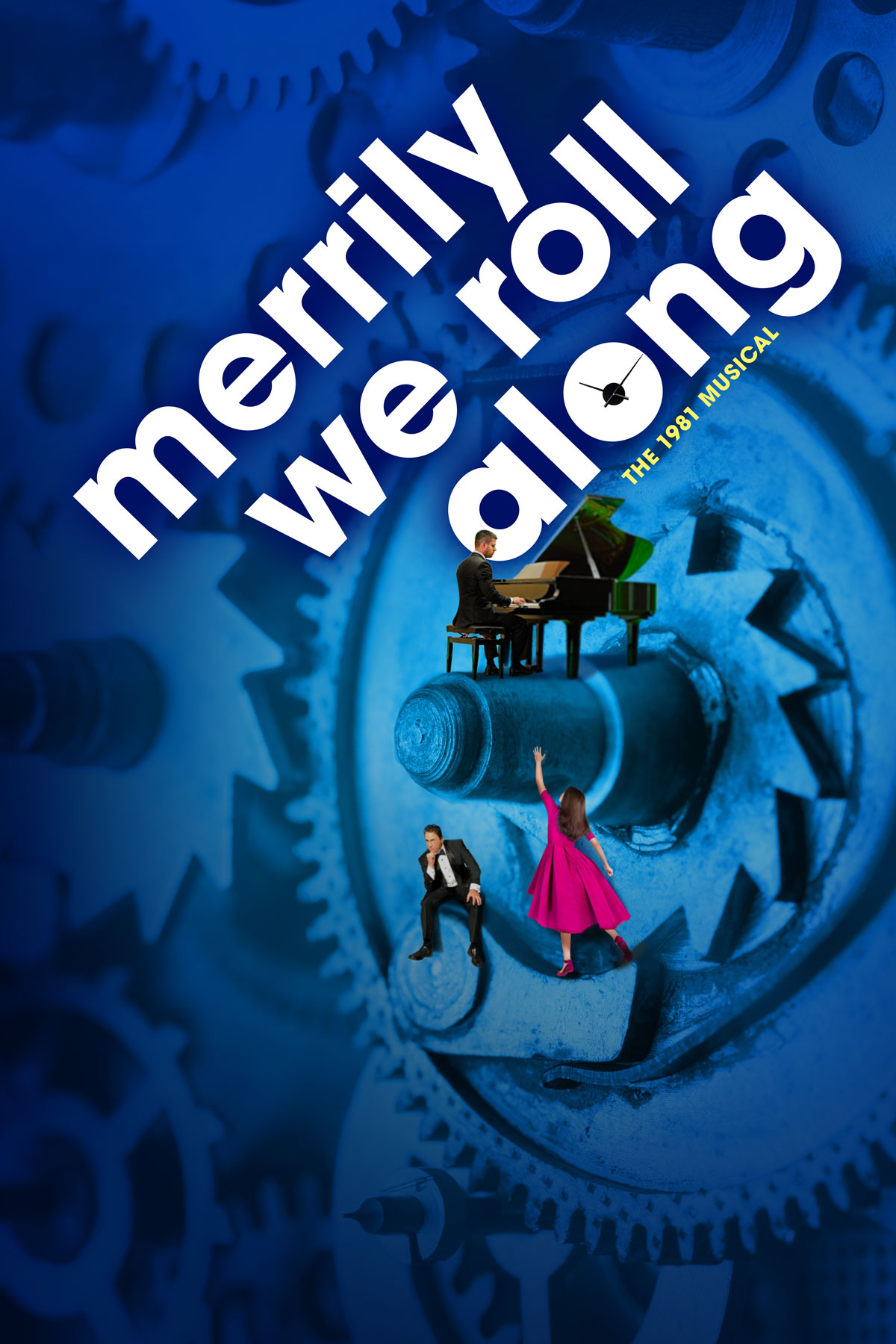
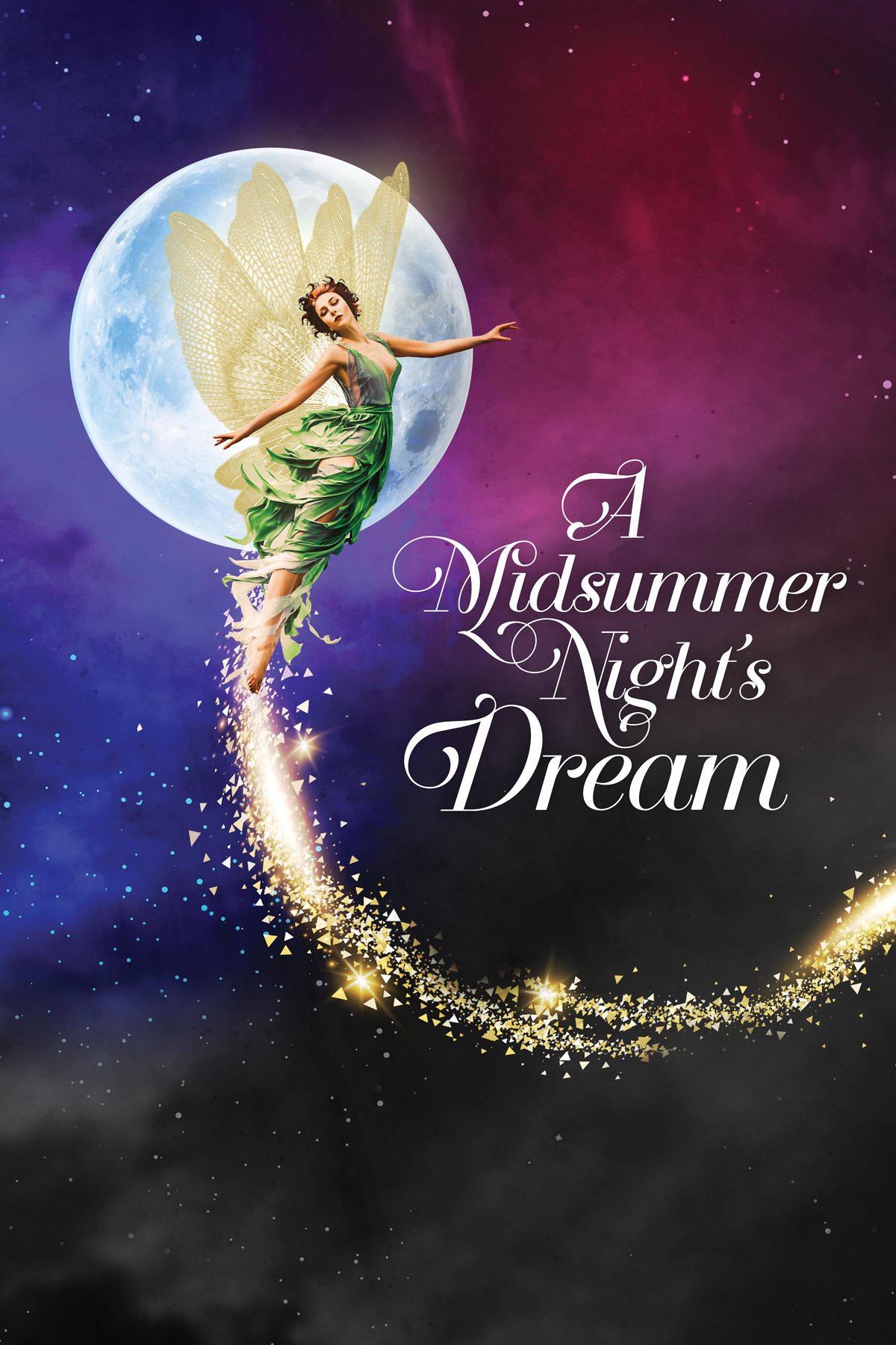
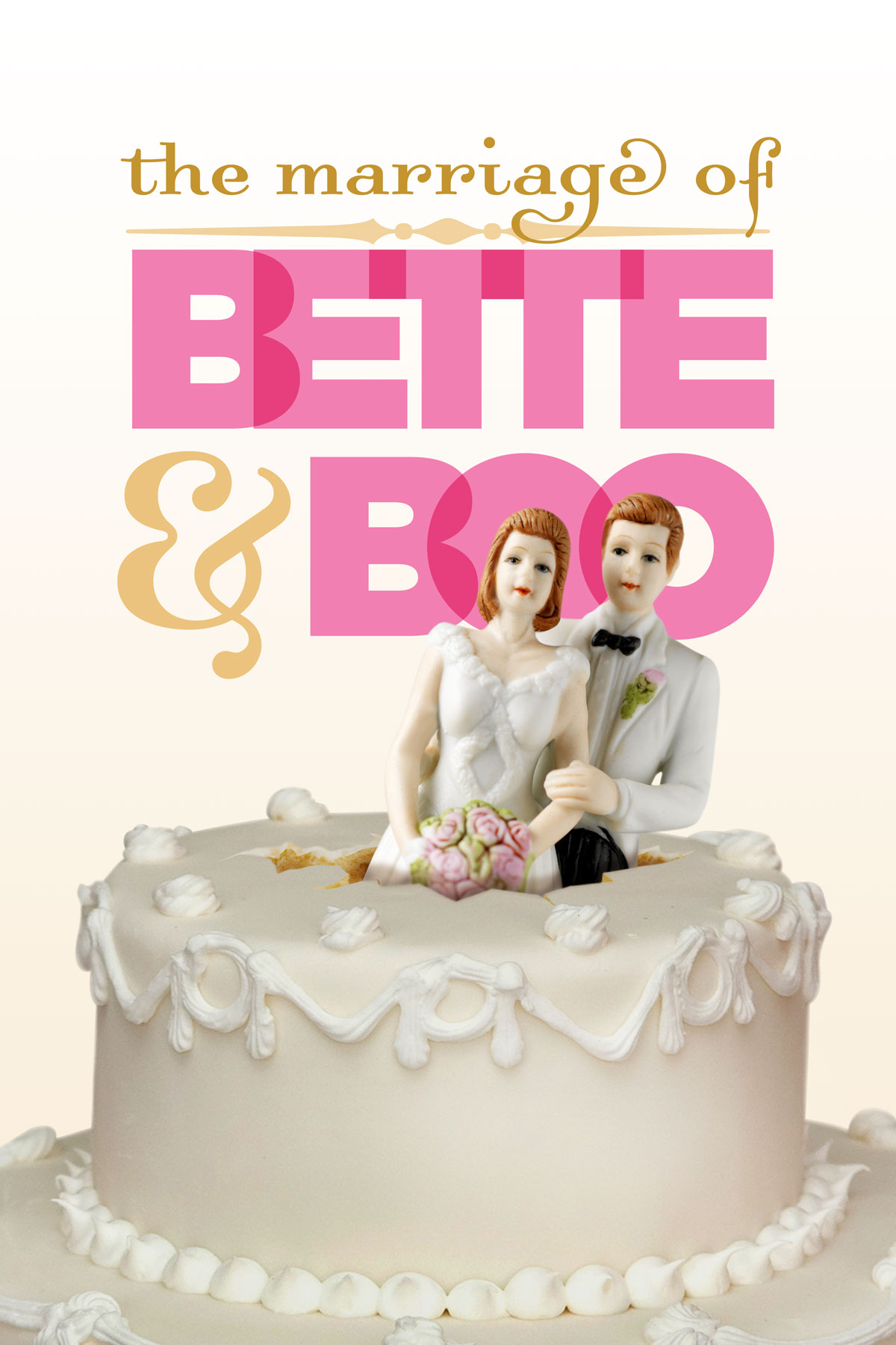
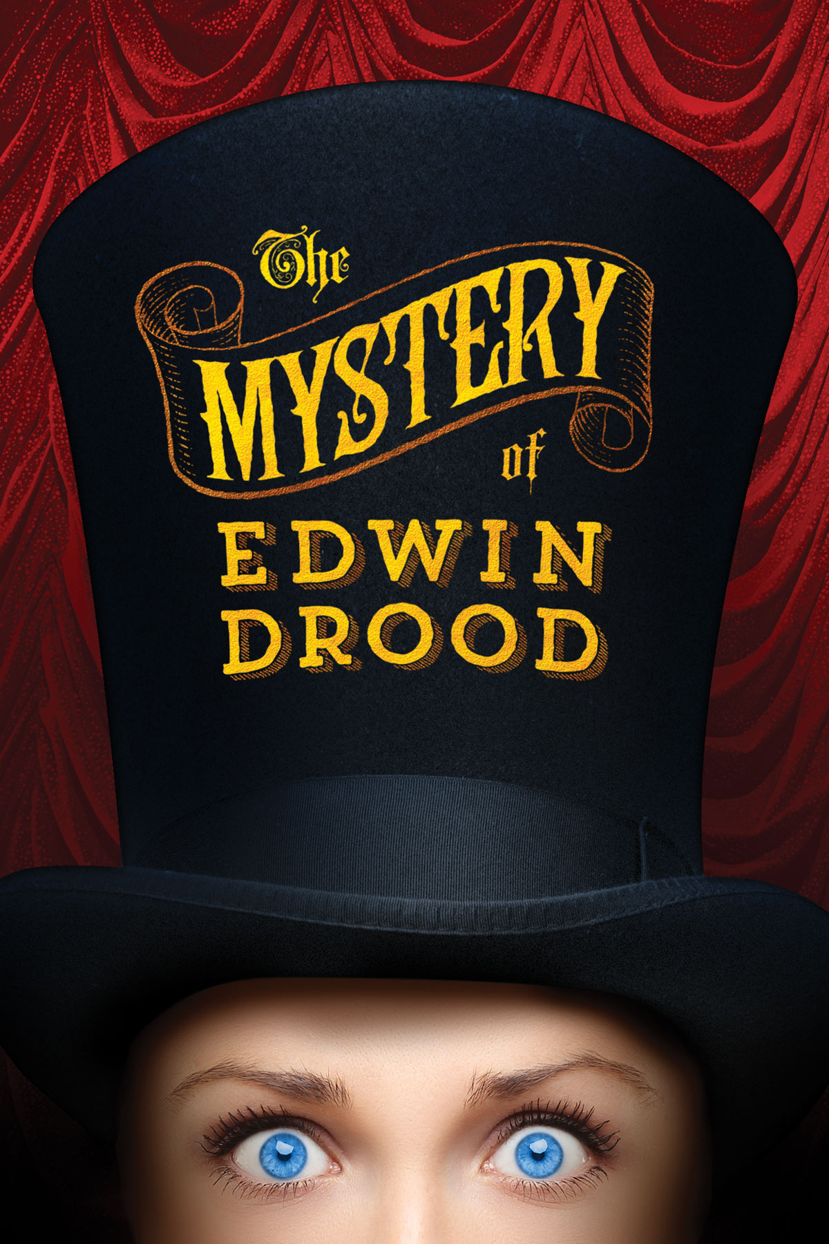
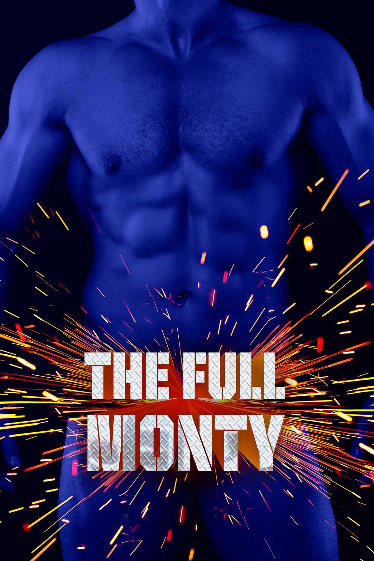
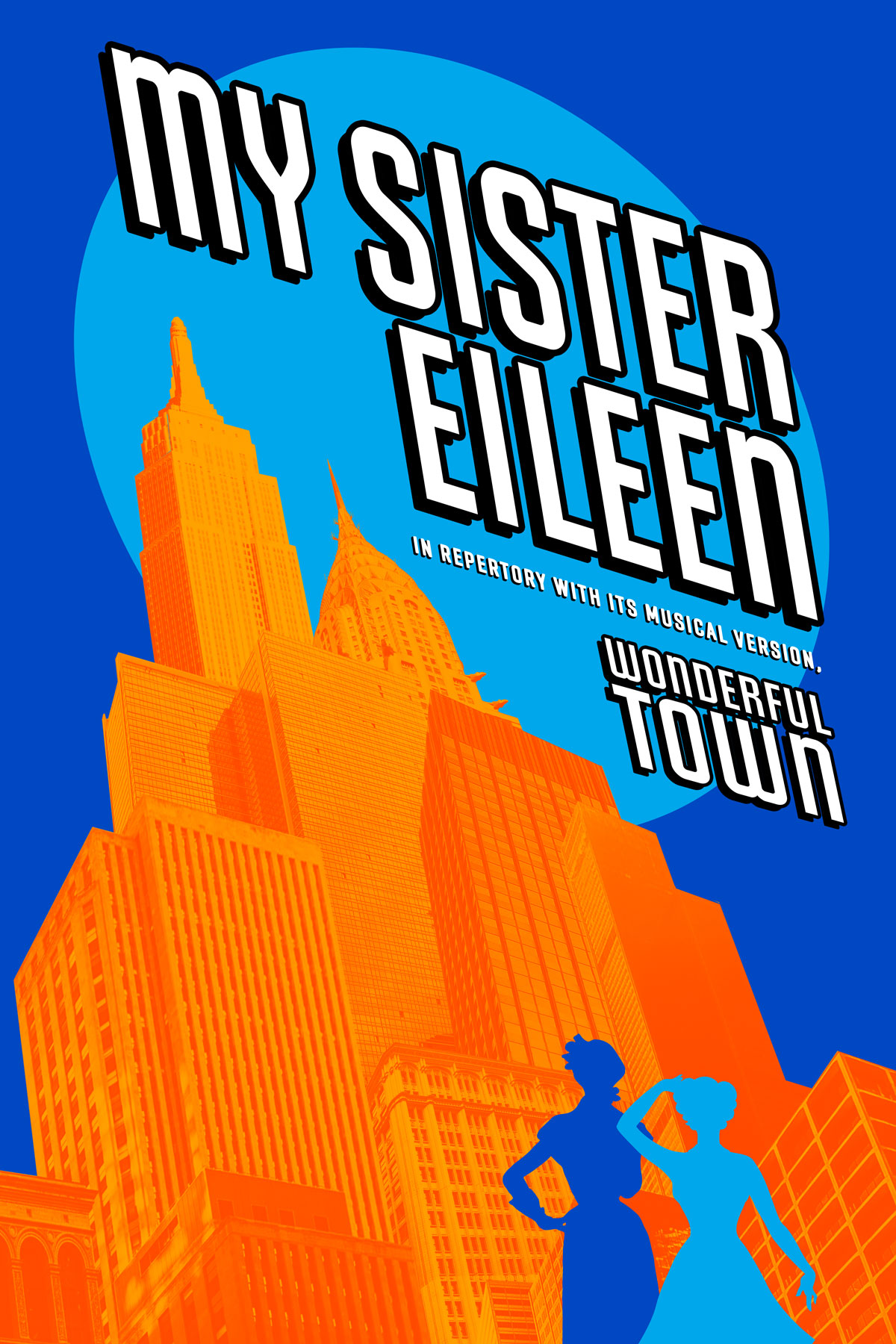
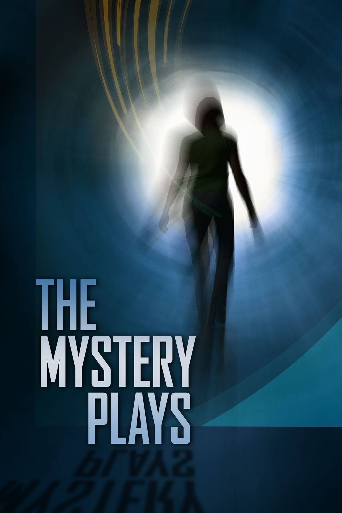
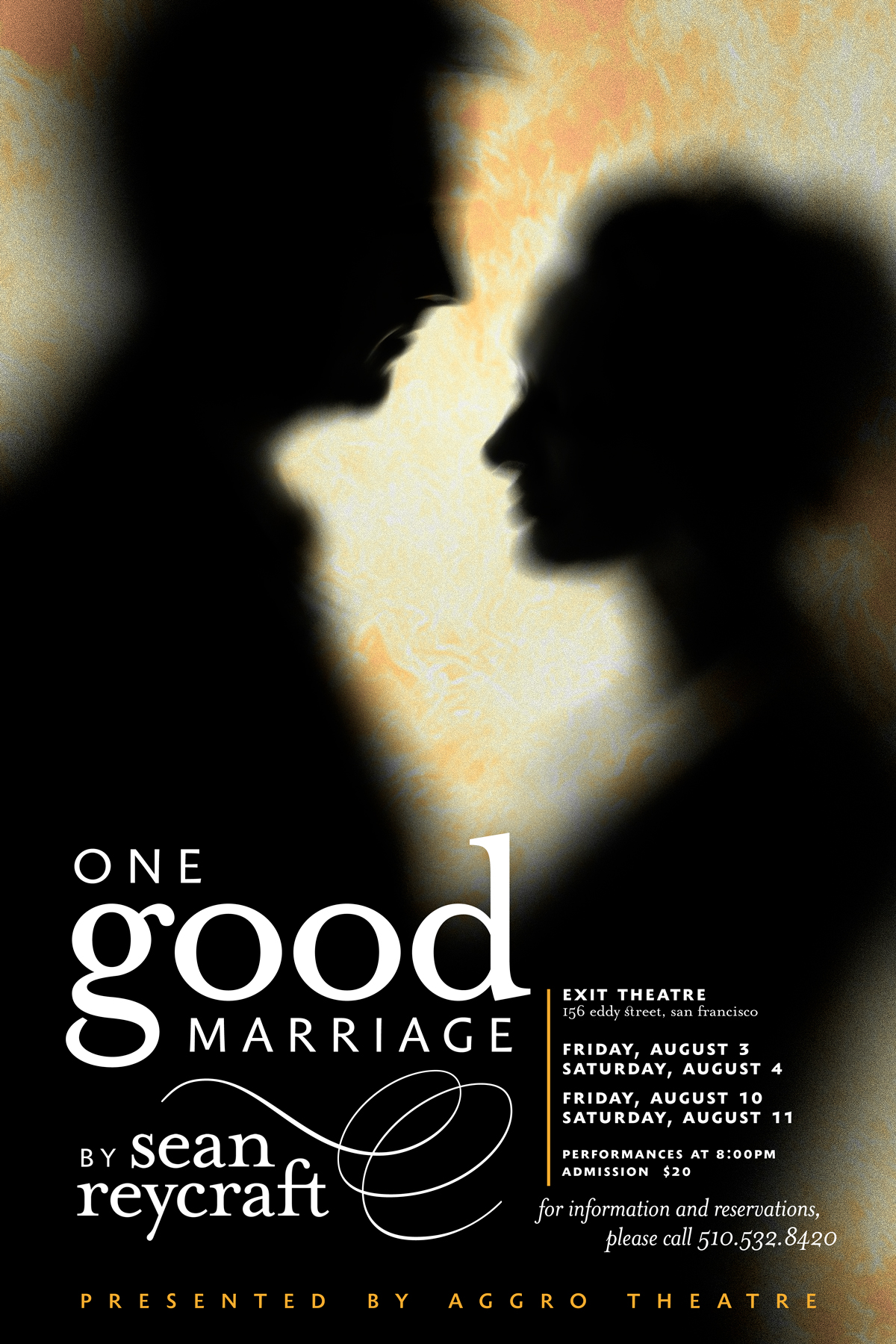
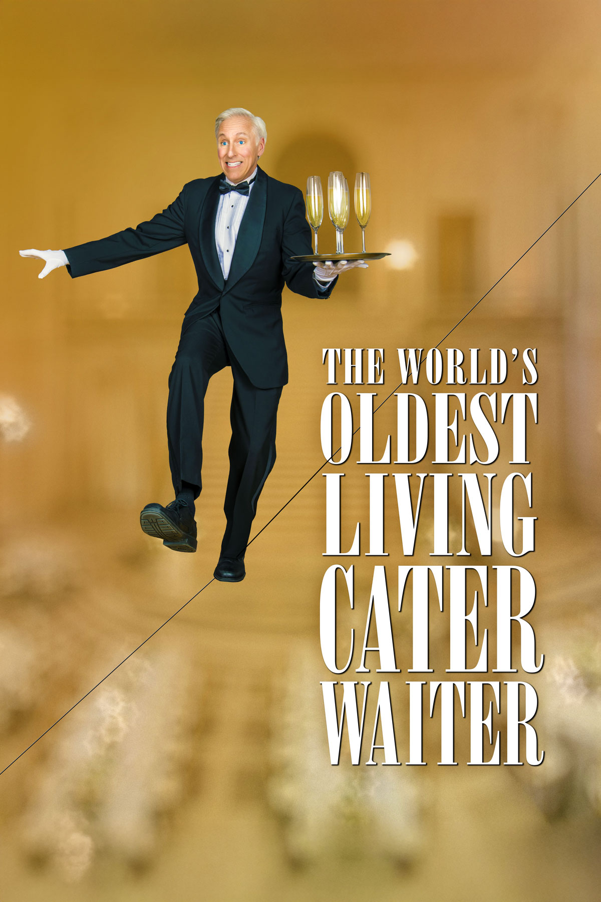
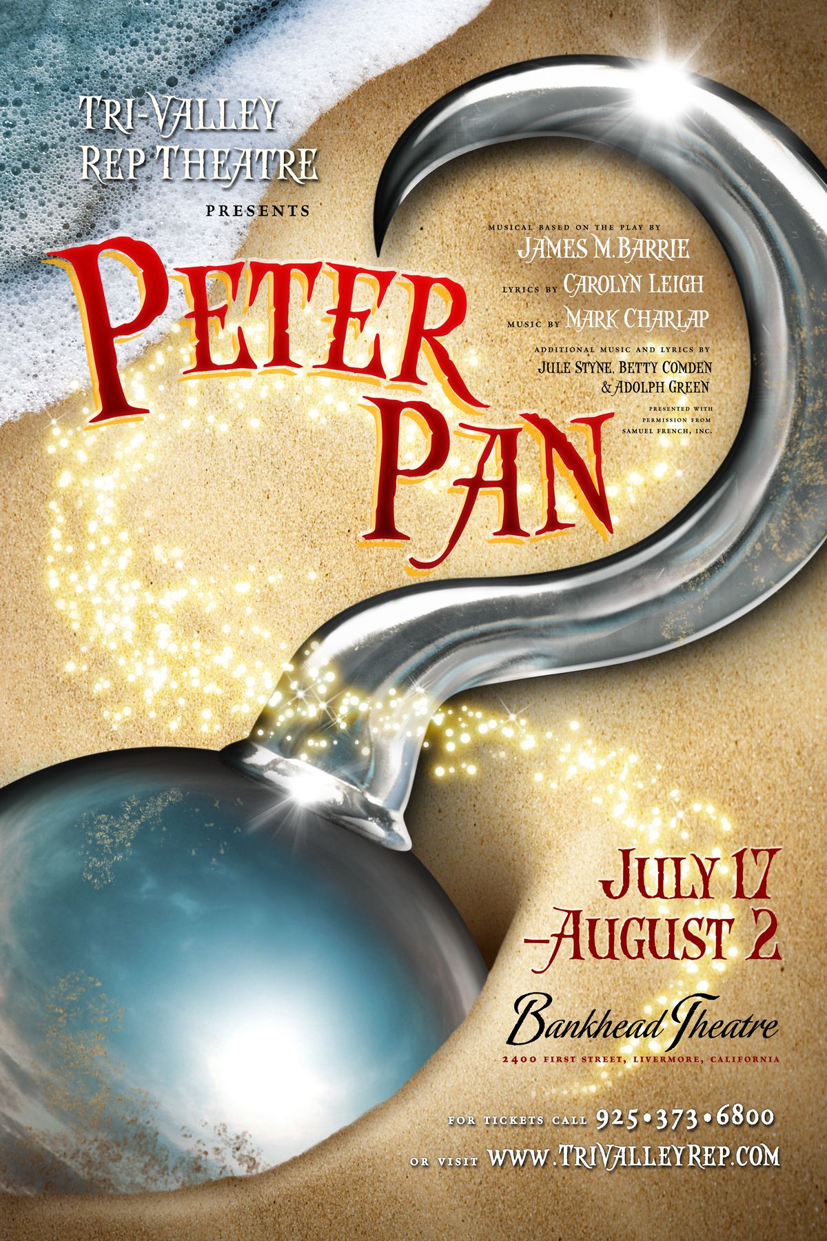
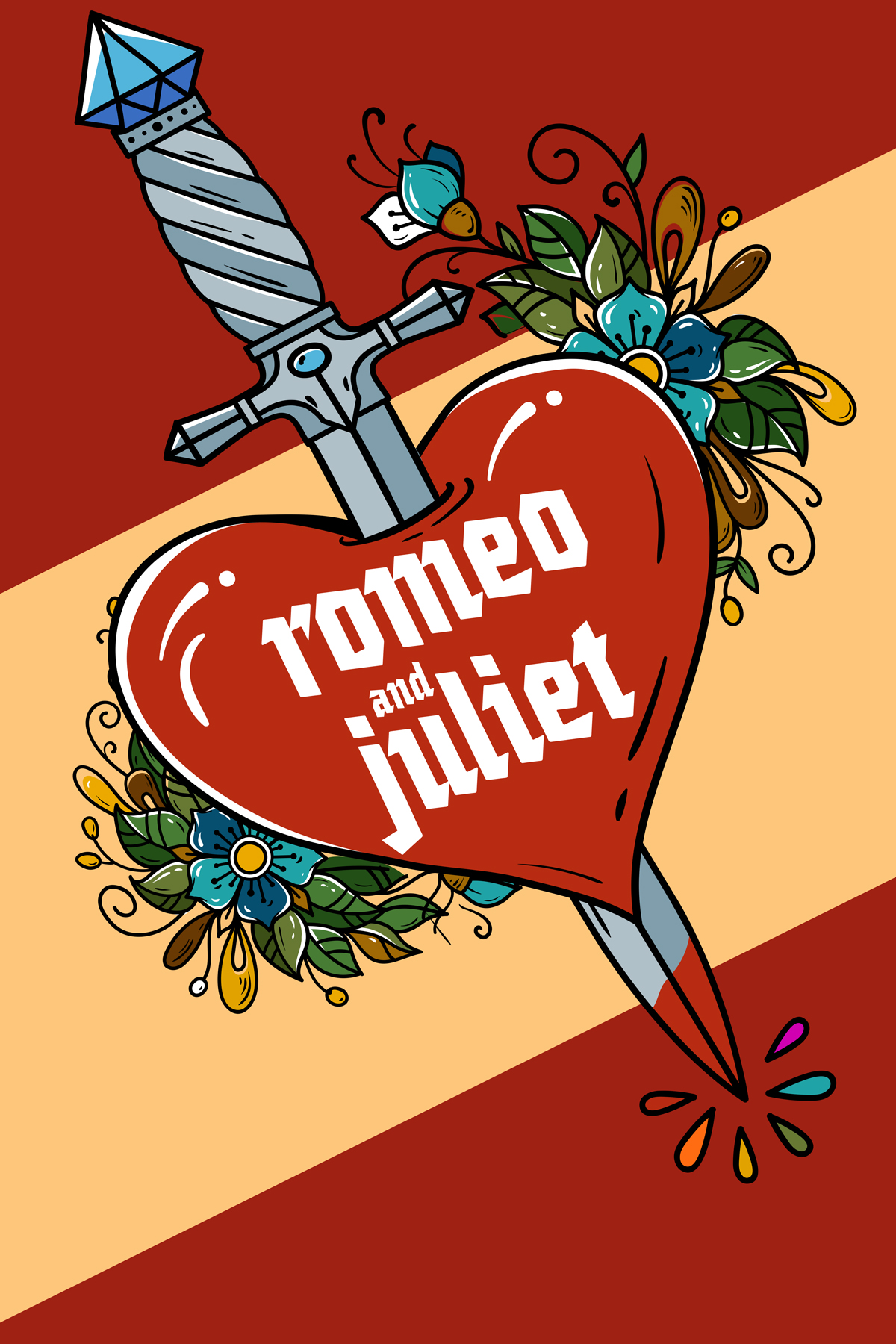
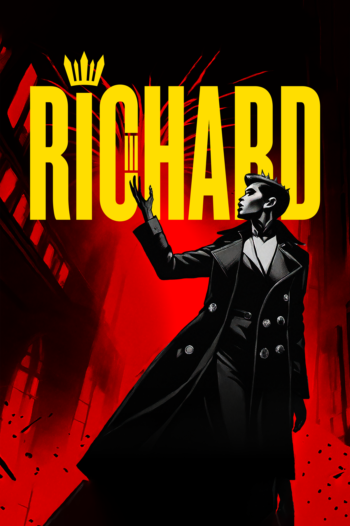
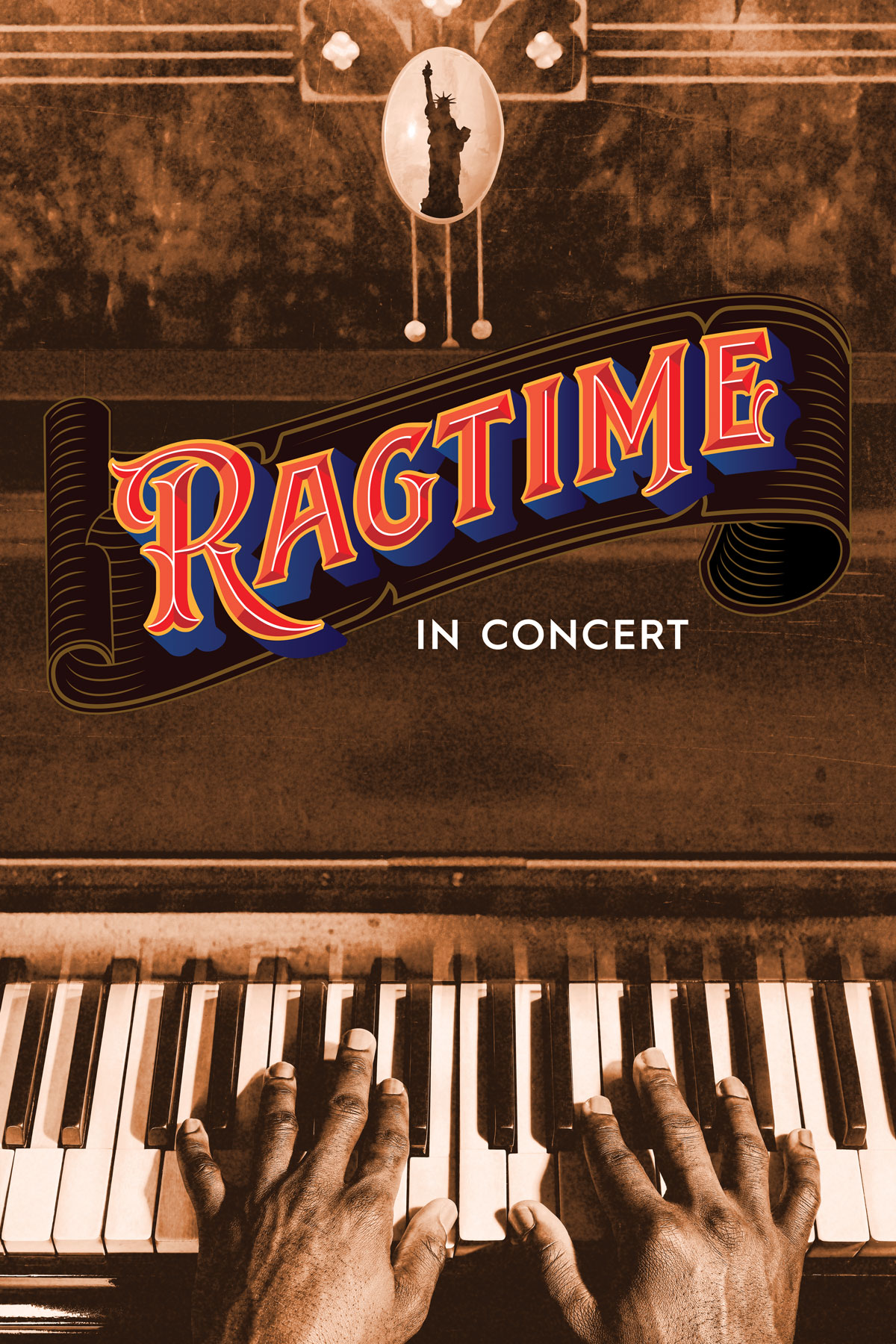
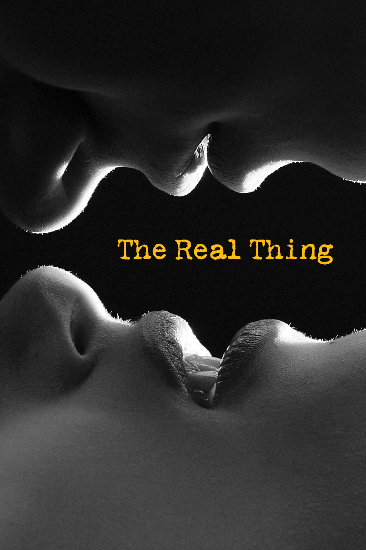
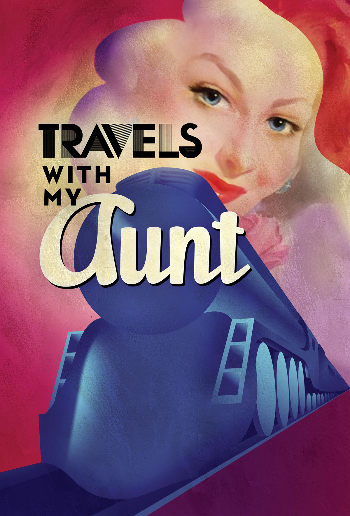
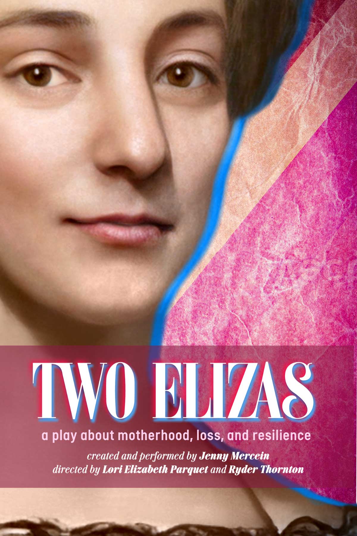
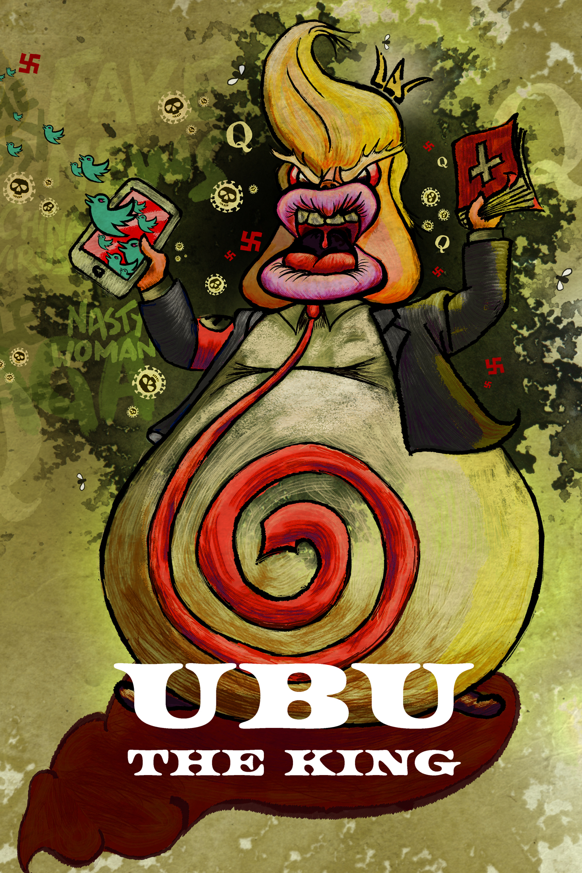
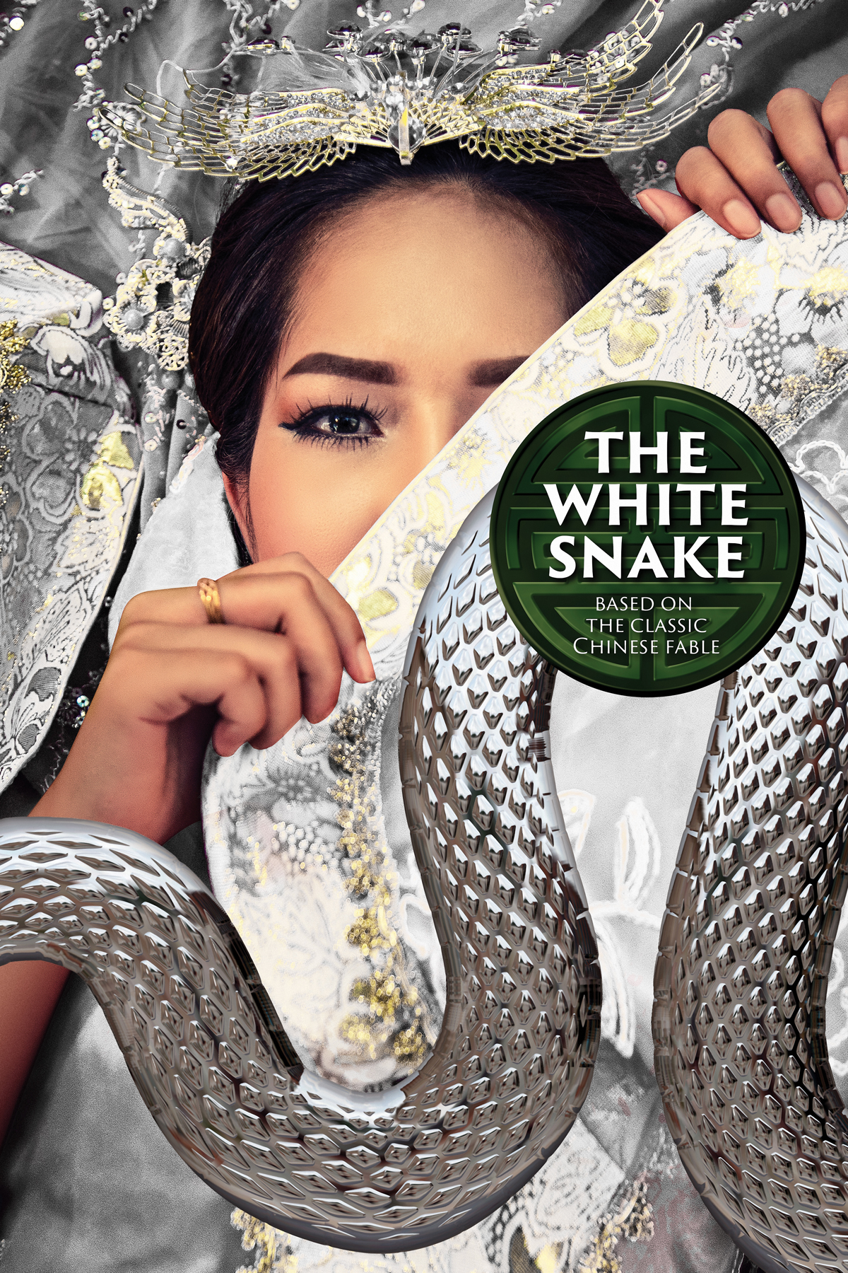
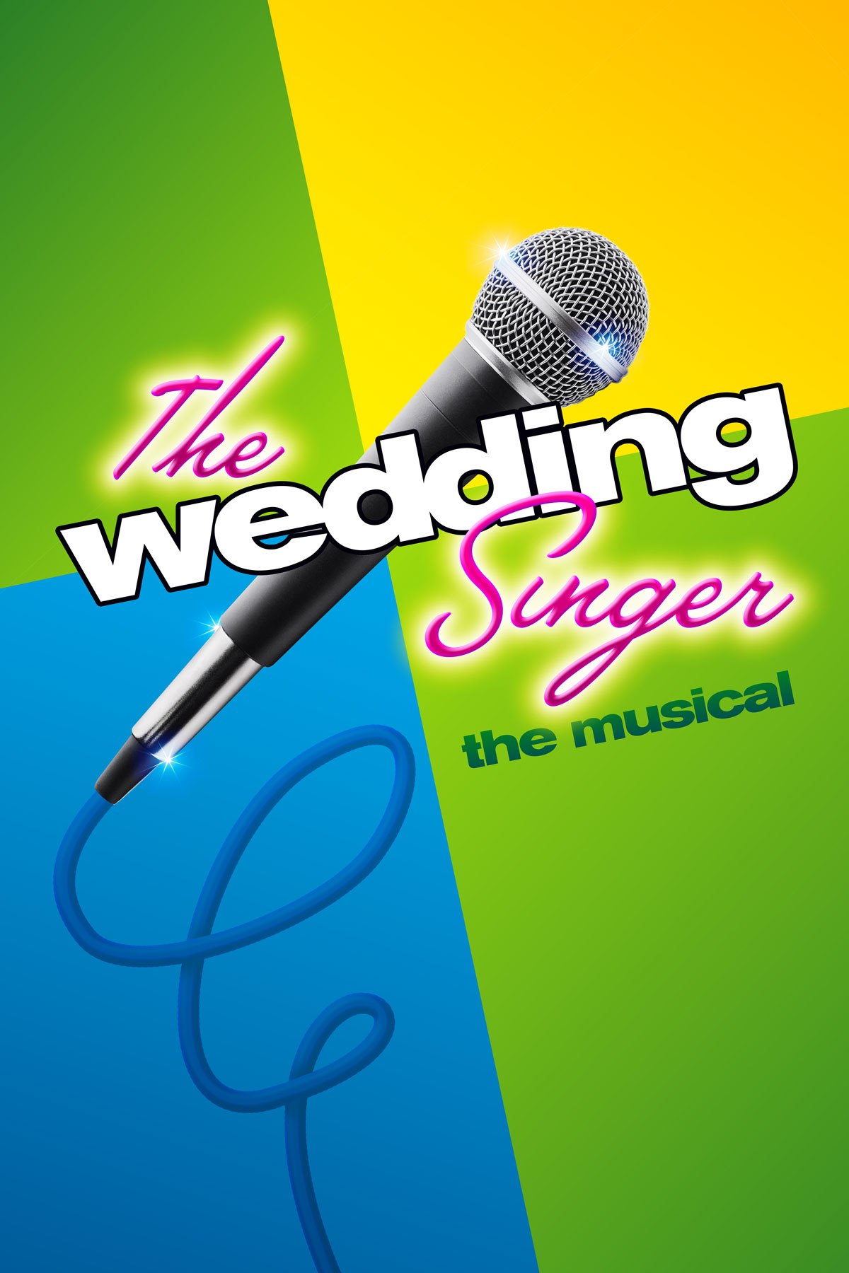
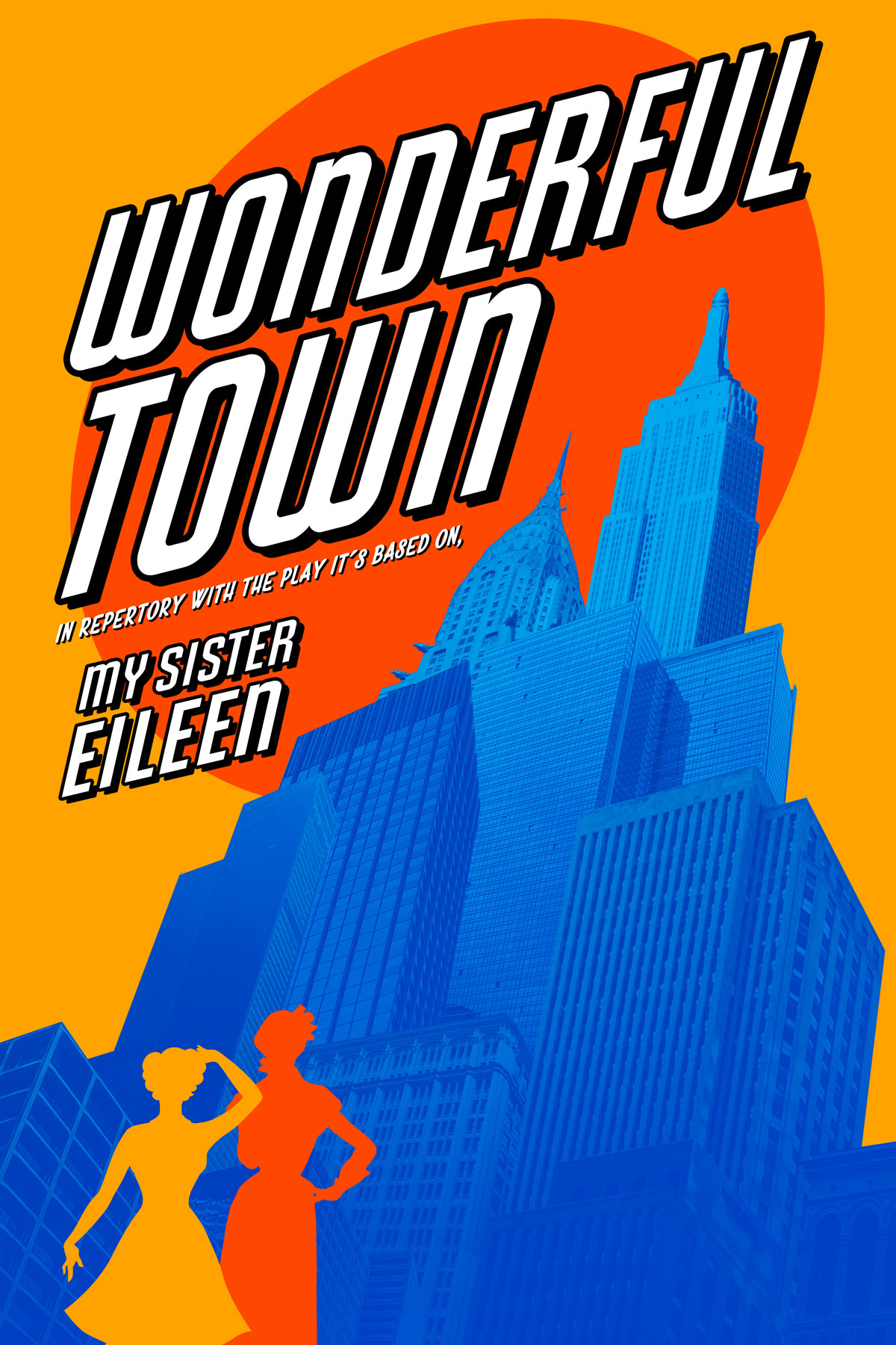
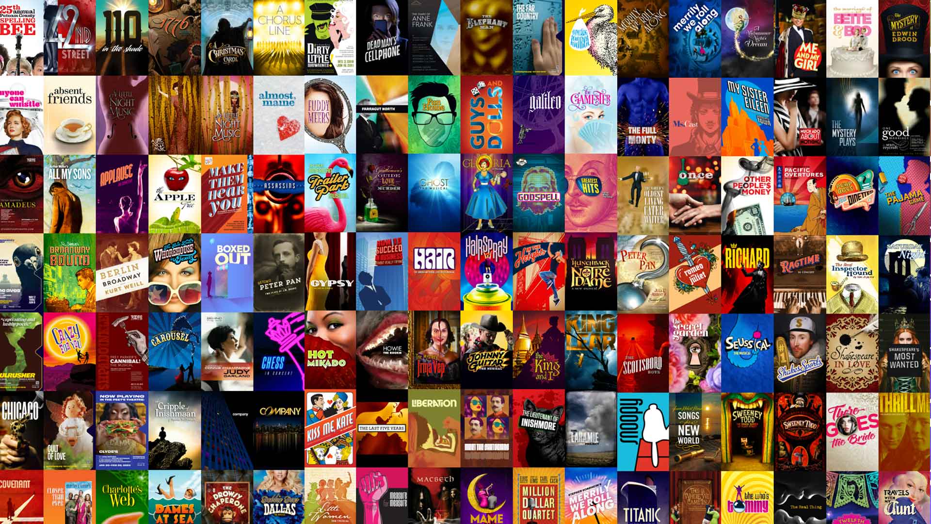
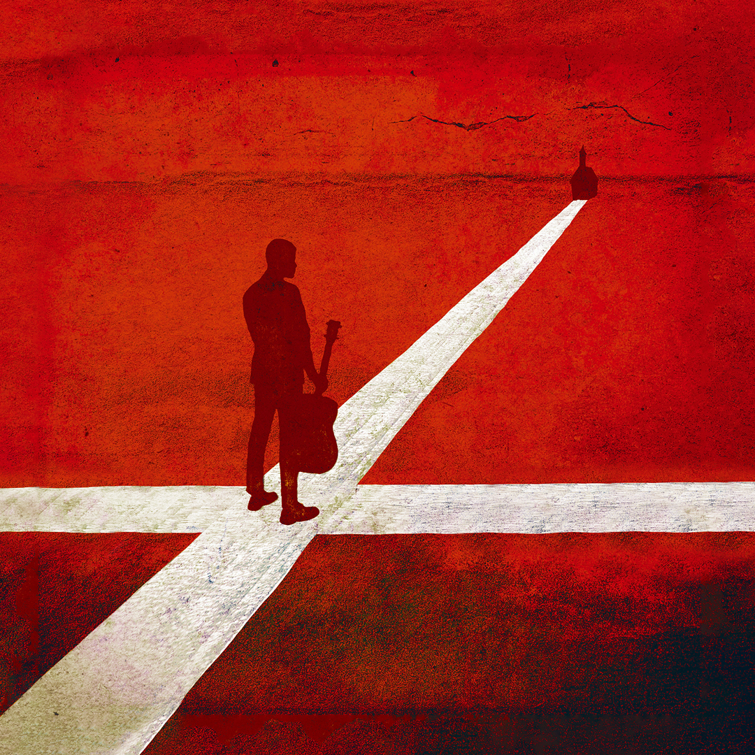
Theatrical key art combines graphic design and illustration. It has two major functions.

First, it has to distill the concepts, themes, or subject matter of the show into one focused, meaningful image.

Second, that image has to be arresting enough to encourage contemporary audiences to leave their homes (harder and harder to do in the streaming age, and I feel the pull as much as anyone), to come to a theatre, and to engage with the work.

In other words, it has to be a kickass image, a kickass design, and it has to get butts in seats.

Below are just some of my favorite pieces — key art that I think does very well at conveying what a given show is all about in a compelling way.
Takeaway:

It's a joy.

Not everyone can make theatrical graphics. Not everyone understands how. And it can be daunting, especially with a lot of shareholders involved. But when it clicks, it's great!