Challenging beginnings
Moon originated as a small company dedicated to presenting concert versions of “forgotten” shows—musicals from the Golden Age of Broadway that had faded from public memory. Regrettably, as their production values and audiences dwindled, it became evident why they had been forgotten in the first place.
In 2016, new Artistic Directors assumed control of the company from its founders and embarked on a mission transformation: Moon would shift its focus and repertoire to musicals that were either new, relevant, or newly relevant.
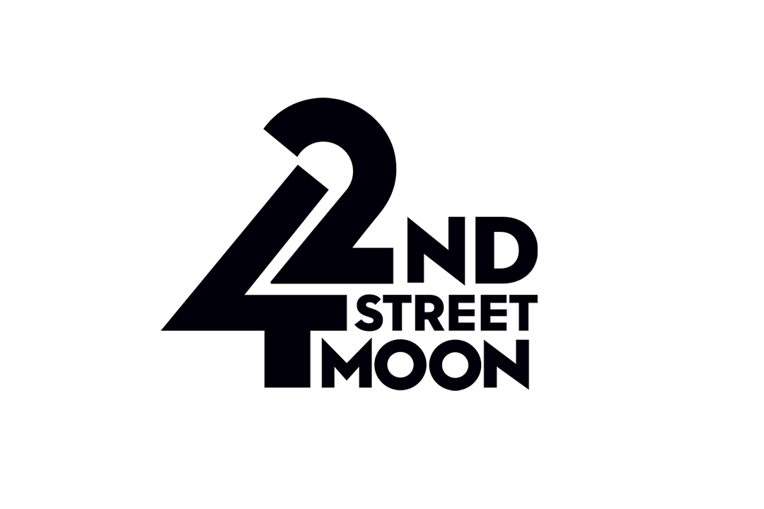
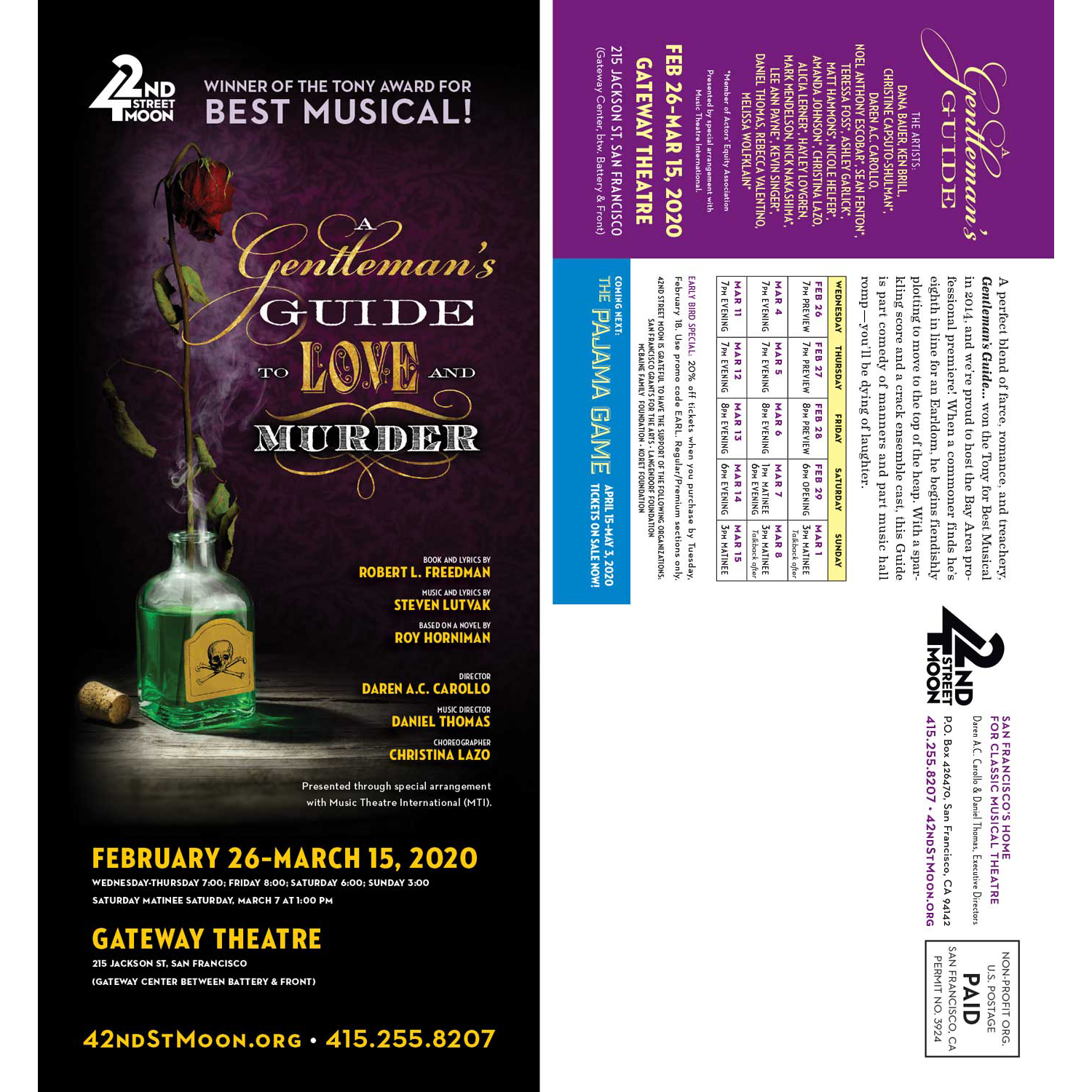
I was appointed to oversee the branding aspect of this process. The objective was to commence with a logo that exuded structural integrity, characterized by impressive architecture and clean lines, which subtly alluded to the Art Deco aesthetic of the company’s (and Broadway’s) past, without confining the company to it.
A bright new day
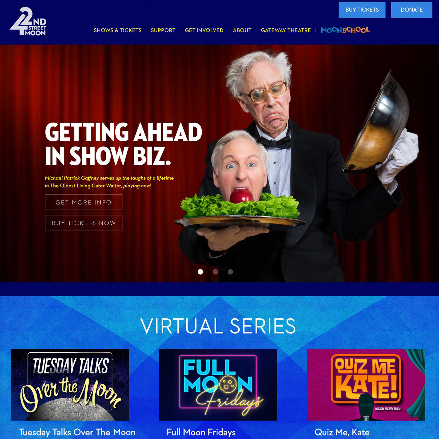
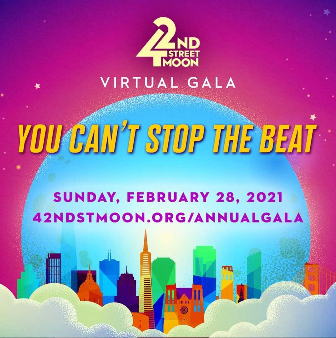
Our solution was a purely typographic logo treatment utilizing geometry as a foundation. The 4 and the 2 were redrawn to seamlessly connect and convey a positive, upward eyeflow. The primary logo employs a single color: black. Reverse versions can utilize either white or a pale yellow, superimposed on either black or deep blue—suggestive of a night sky, which serves as the sole reference to the moon within the logo. Similar to the lights of Midtown, the glow here is not centered around celestial bodies but rather theatrical signage.
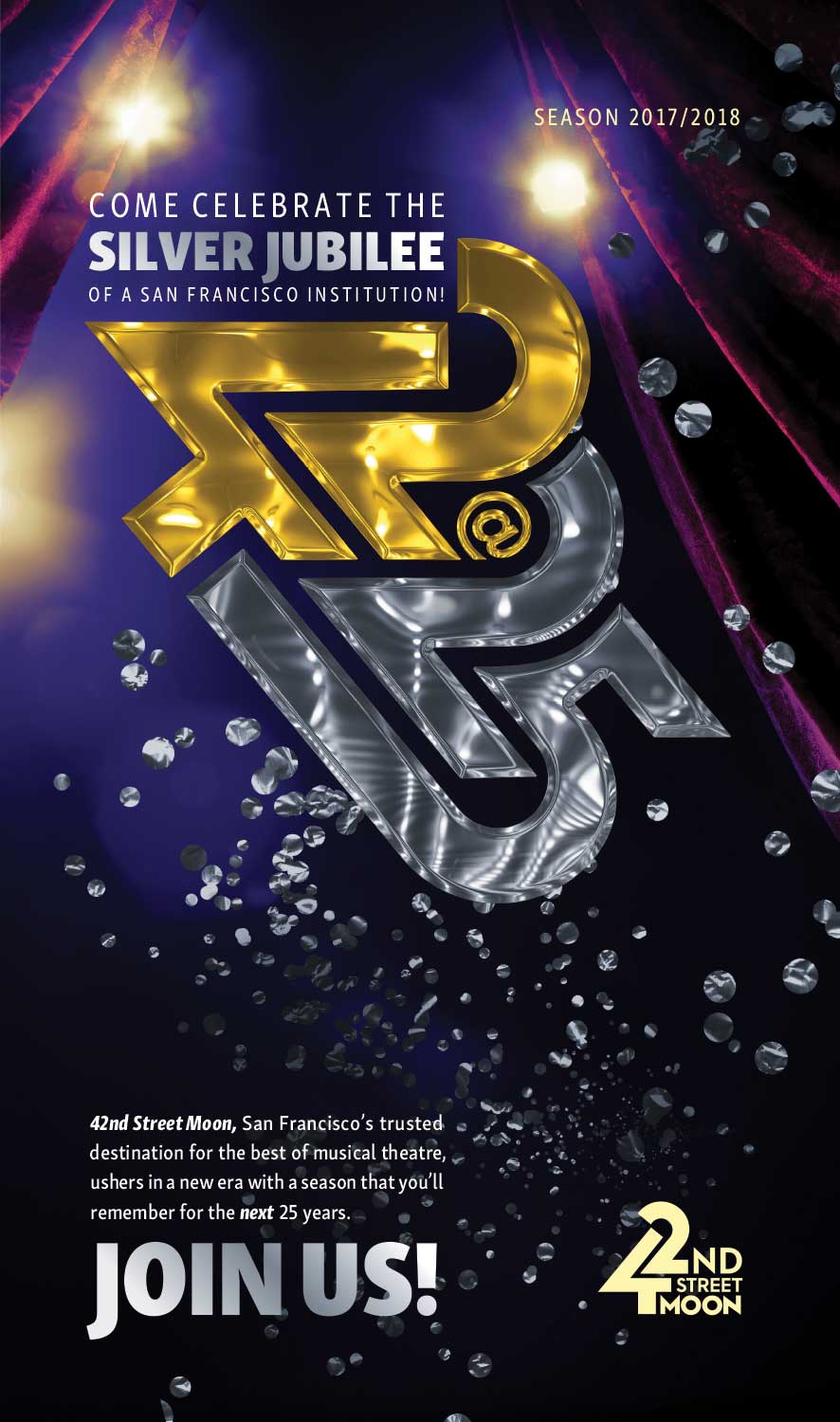
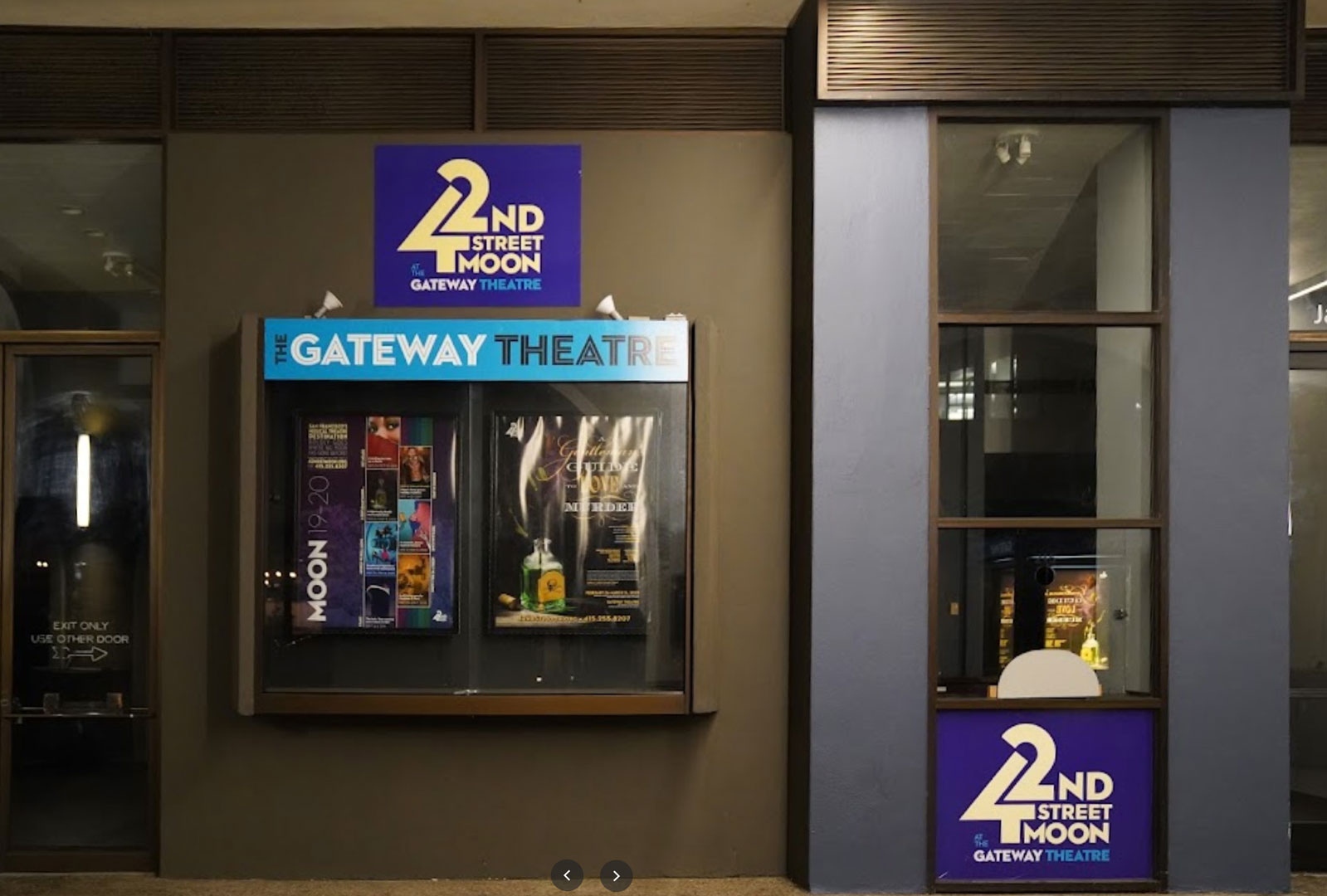
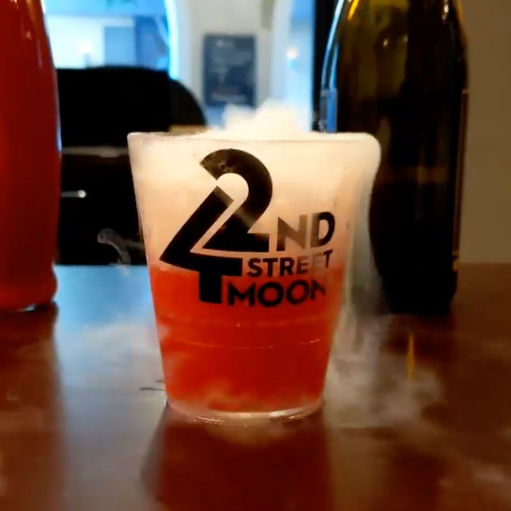
Maintaining the geometric nature of the logo allowed for its adaptability to various situations. It could be transformed into a 3D representation reminiscent of Hollywood studio logos, a lit marquee, or a vibrant rainbow for Pride celebrations. The robust structure of the logo ensured its integrity regardless of the content it was filled with or the manner in which it was treated.
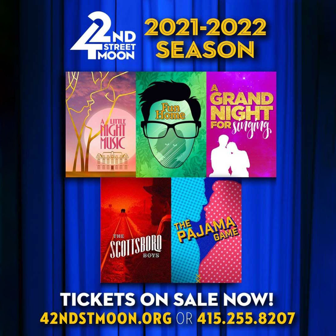
The architectural design of the logo established a visual language that could be utilized for subsidiary brands, including their education arm, a 25th Anniversary brandmark, and other programming initiatives.
Furthermore, the project encompassed additional assignments, particularly during the COVID-19 pandemic and shutdown, when streaming content became increasingly crucial.
It shone.
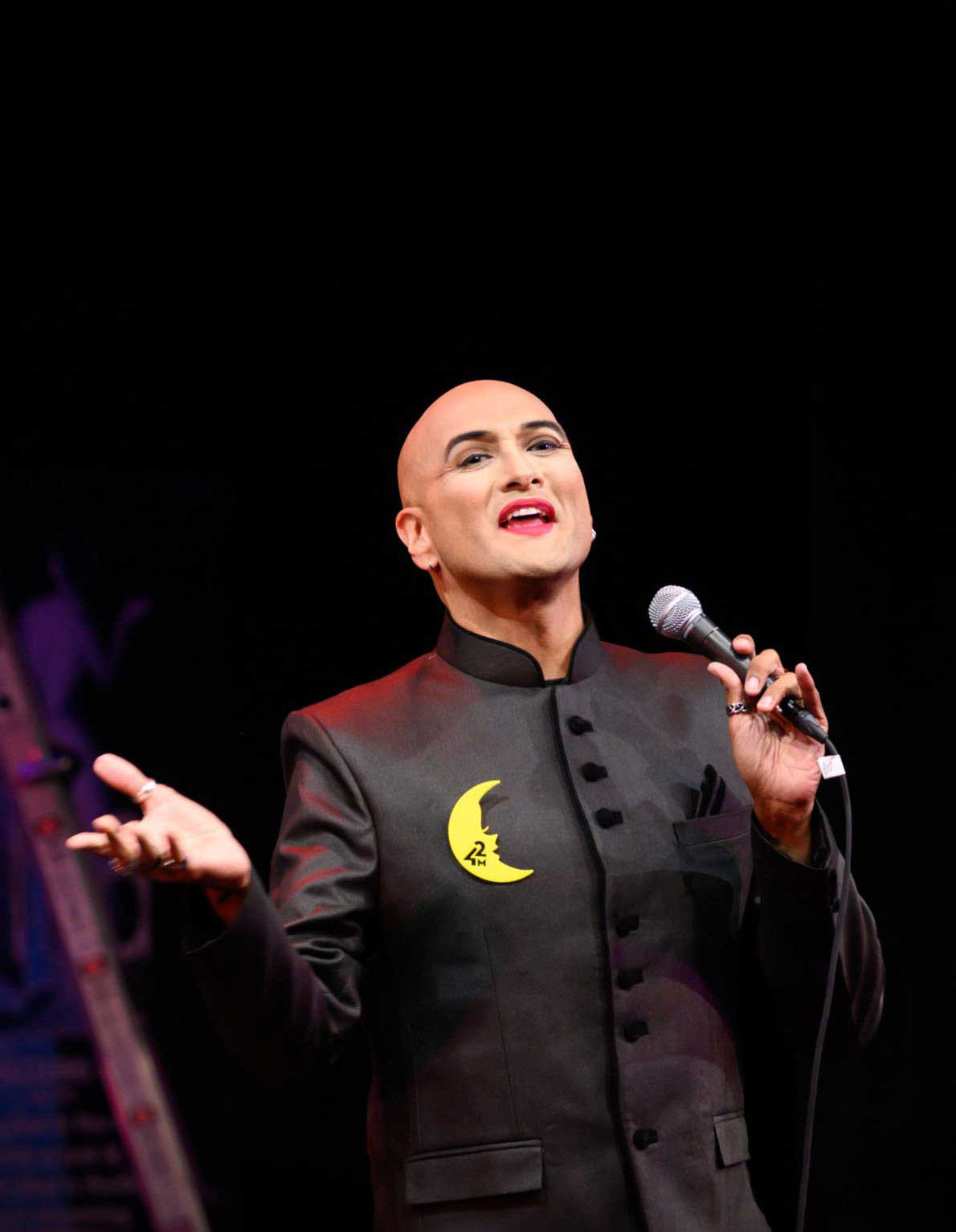
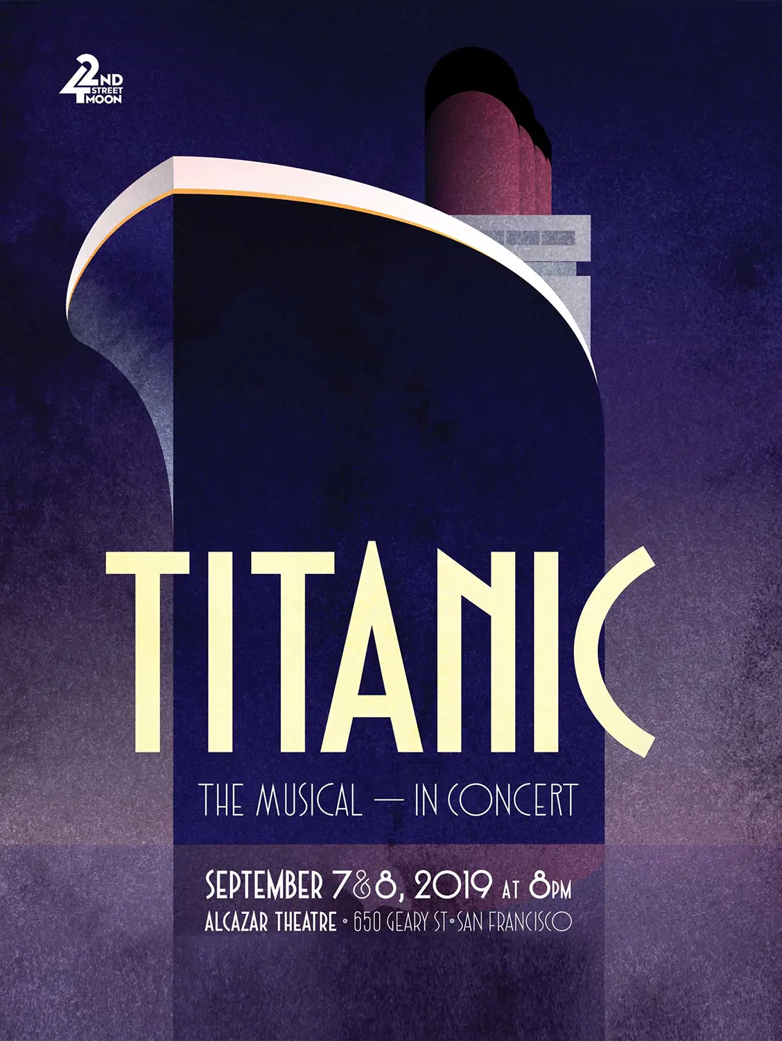
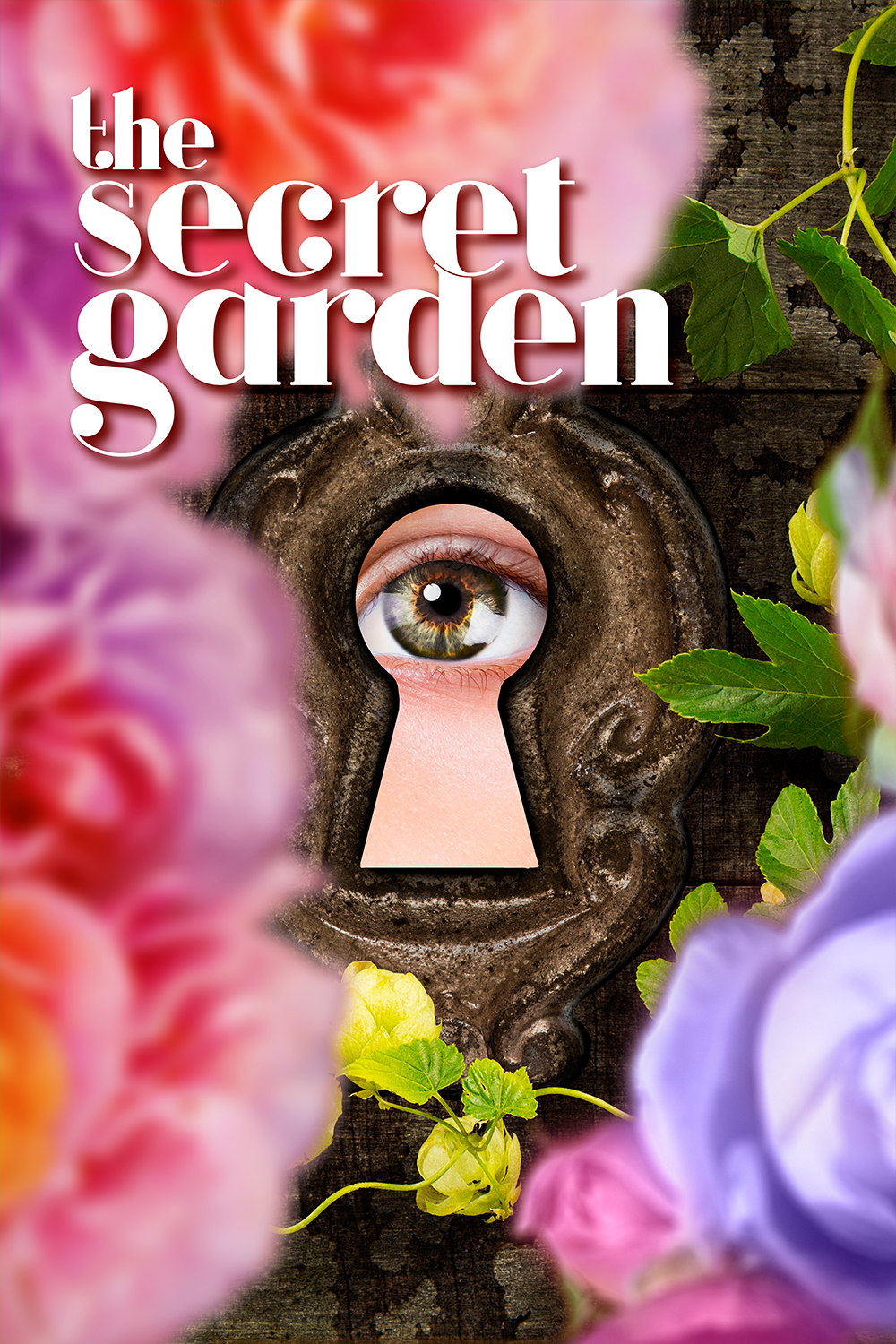
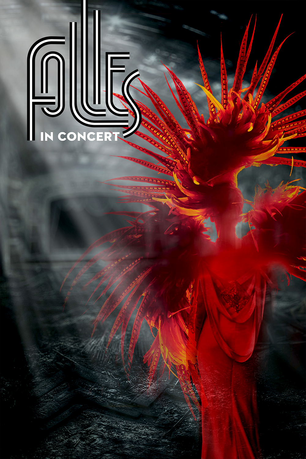
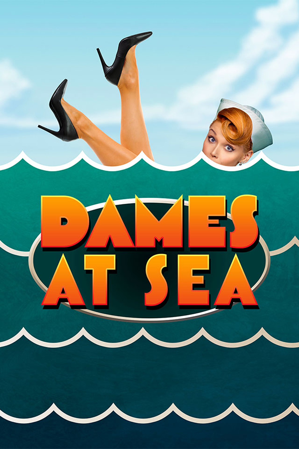
The collaboration with 42nd Street Moon proved to be one of the most fruitful partnerships of my career. In addition to the comprehensive rebranding, I was responsible for creating all their season key art for six years.The results were remarkable. 42nd Street Moon transitioned from a theatrical anomaly to a prime San Francisco theatre destination, encompassing both classic and contemporary productions. Implementing brand guidelines across a prominent public institution and giving it a distinct identity was a very fulfilling experience. When Moon fell victim to the disastrous, post-pandemic wave of theatre closures — what the SF Chronicle called the "theatrical death spiral," the Bay Area lost something special.