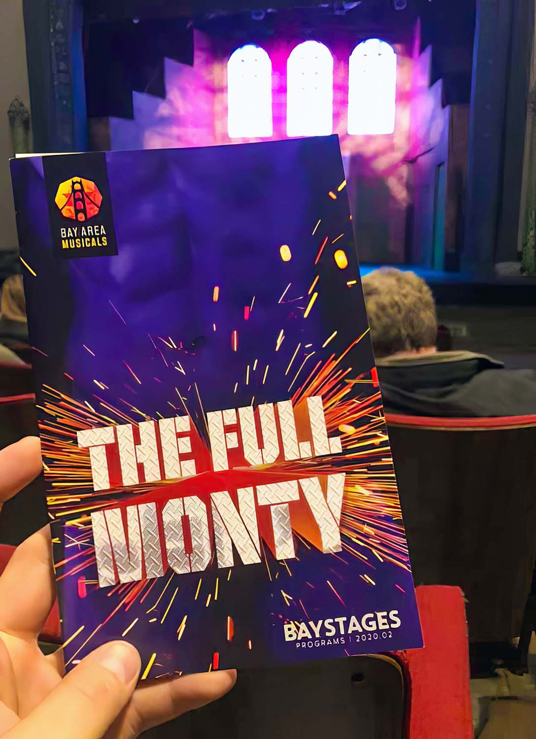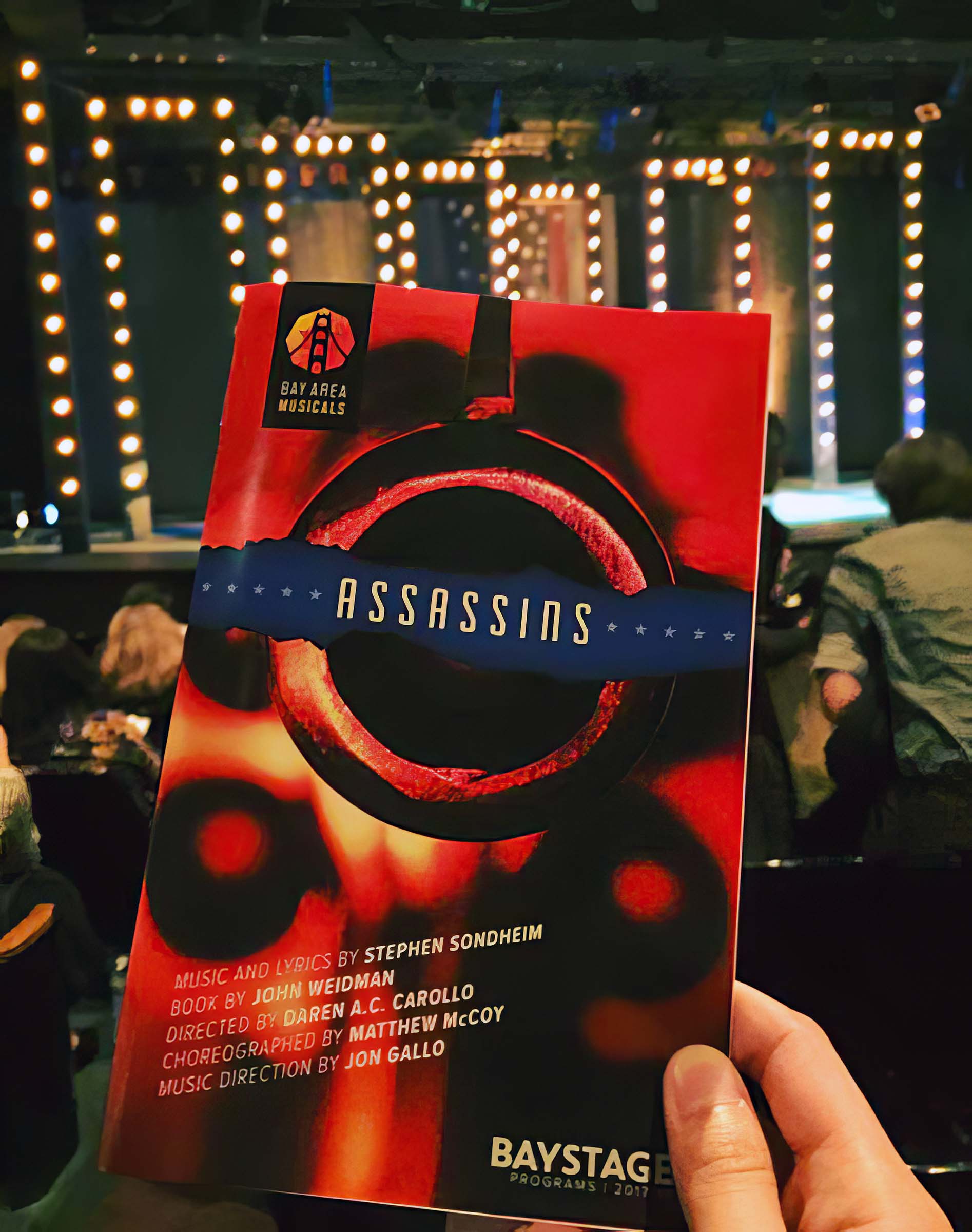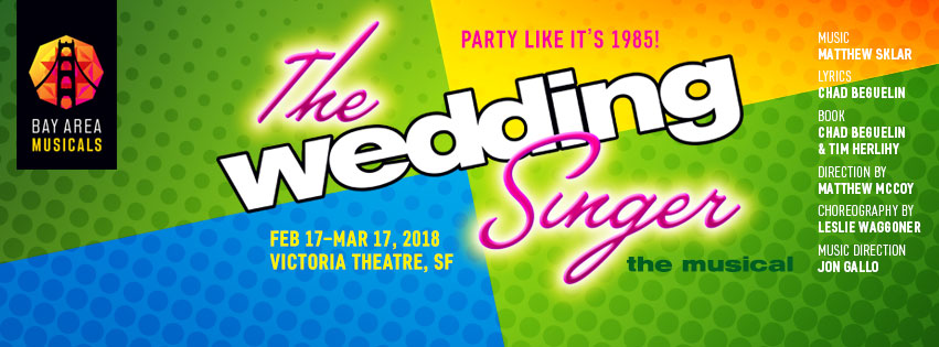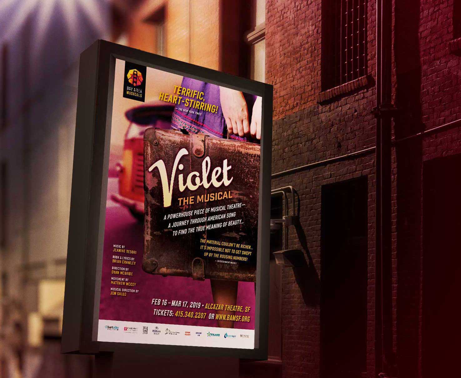


Part One: BAM
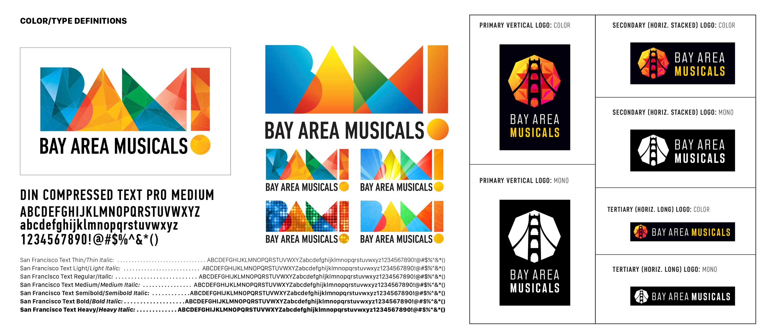
The task: start with a logo built for versatility—not evocative of any one era, but geometric and universal. Rather than have it be on trend, make it adaptable to that it can subsume any design trend that comes along.
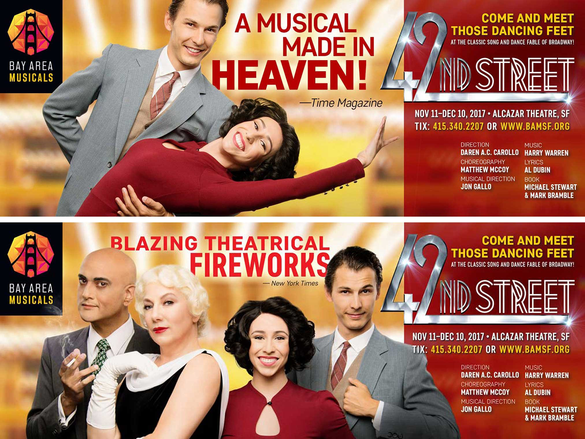
The result was a mark that was geometric, energetic, vivid, and capable of being filled with any on-trend color scheme or texture (at the time, polyhedral fills were in vogue).
The logo proved popular—I even began seeing it on tee shirts worn around town. And then BAM! got the cease and desist letter.
It was with a heavy heart that I was told that the Brooklyn Academy of Music—an extremely prestigious BAM for decades upon decades—was asserting its singular rights to the name, and aggressively.
We had to pivot, and fast.