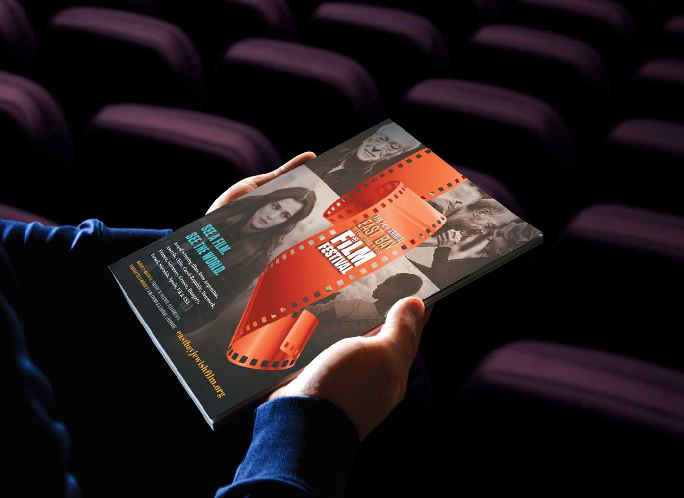
The East Bay International Jewish Film Festival has been a client of mine longer than any other. It’s an organization that aims for diversity, variety, and impact in both its programming and staffing. This principle extends to its marketing strategy.
Thinking backwards.
When I initially received an inquiry from EBIJFF’s Director, Riva Gambert, I was still a young designer. My initial inclination was to develop a concept by focusing the festival’s dominant characteristics: “East Bay,” “Jewish,” "International." Obvious, right?
But Riva sought a concept that resonated with a universal, diverse audience, encompassing individuals of all ages and backgrounds. She wanted imagery and branding that were engaging and accessible. The inherent risk in this approach was the potential for genericity, which could diminish the impact of a highly specific concept.
So… what to do?
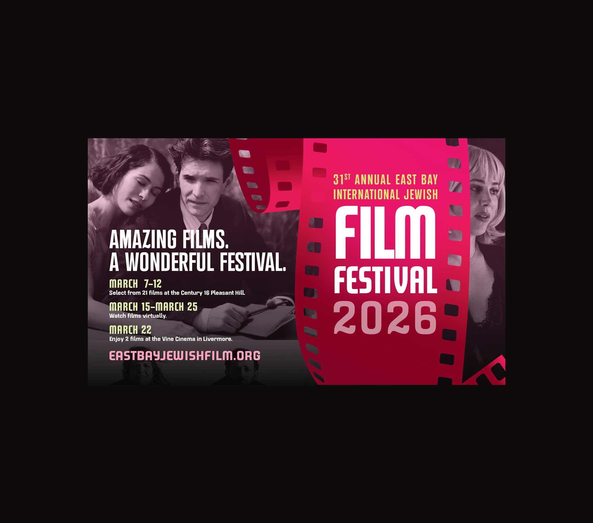
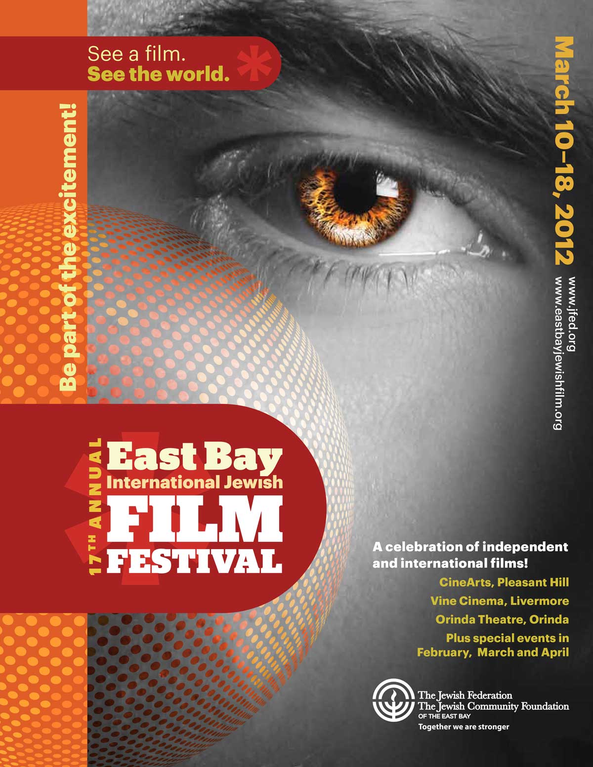
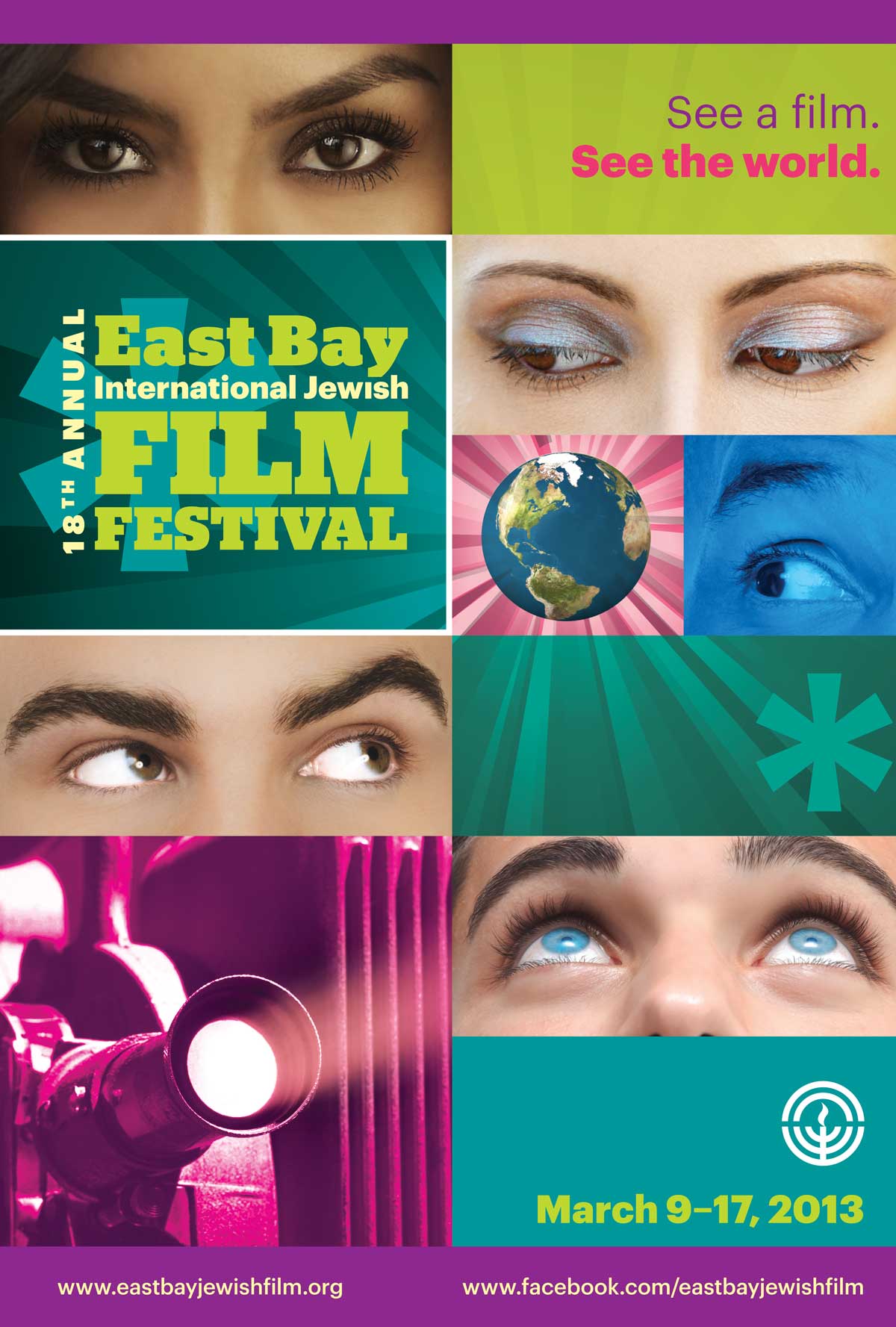
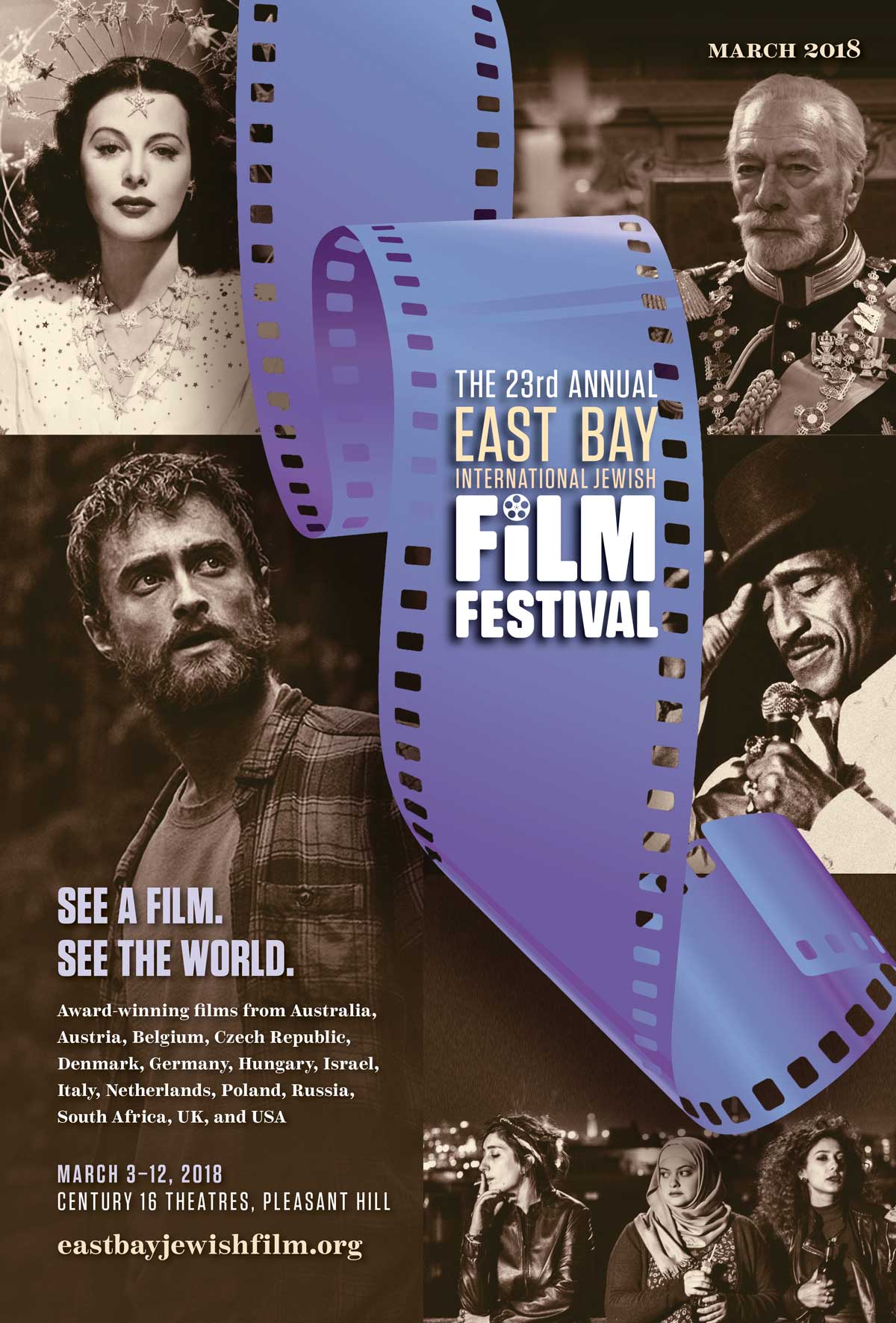
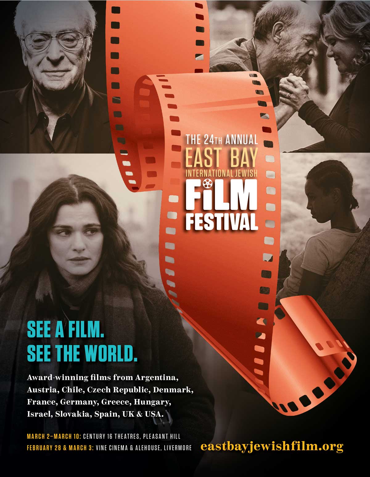
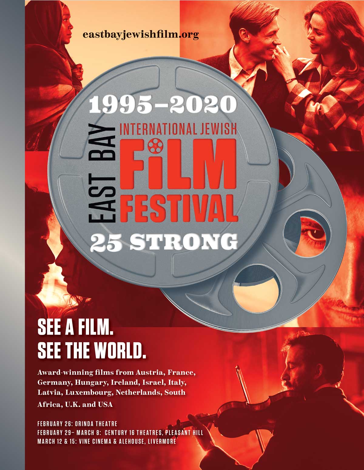
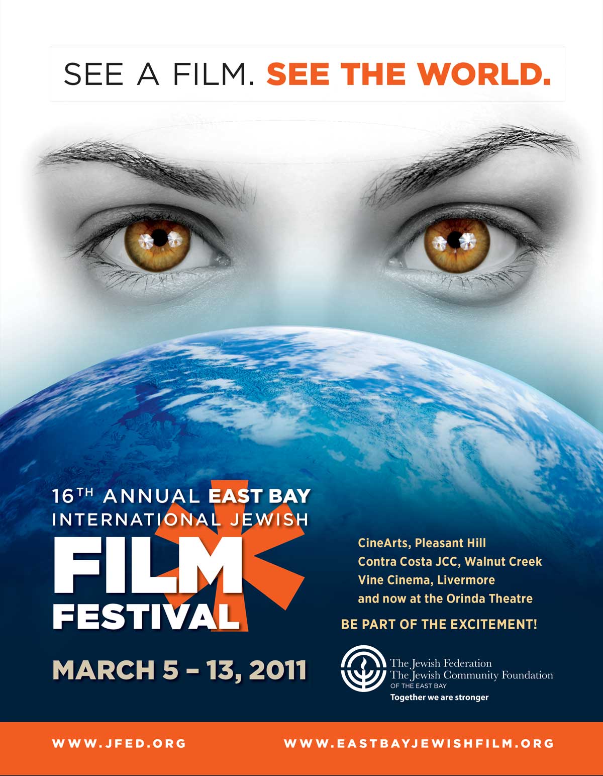
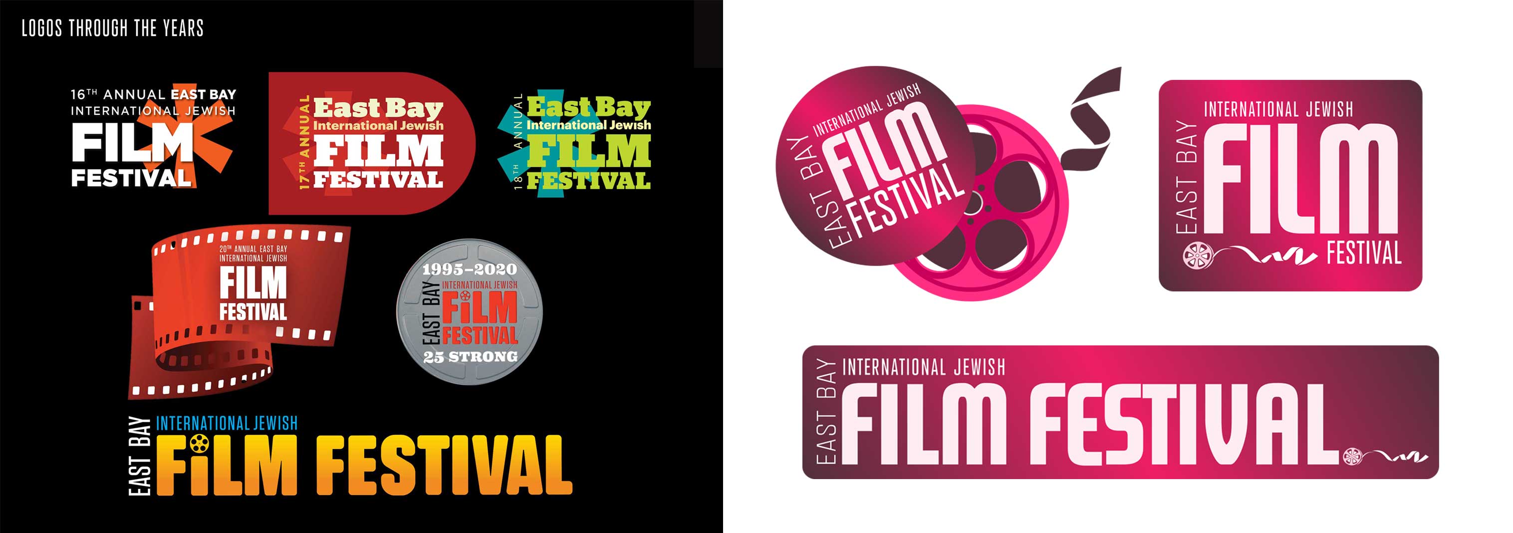
Festival catalogues through the years
Embrace the change.
The answer was not to sacrifice the brand in favor of marketing, but to create a brand from the marketing. Make it clean. Make the type punchy, colorful, and fun… and trust where it leads.
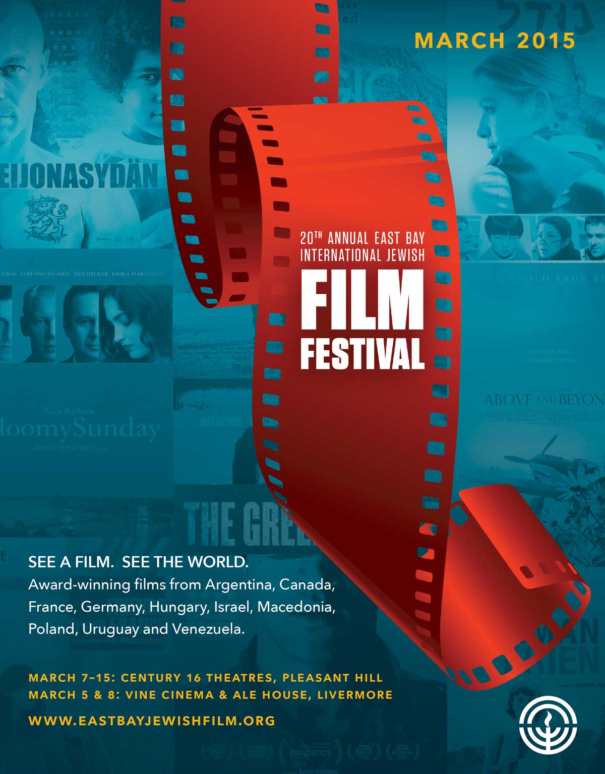
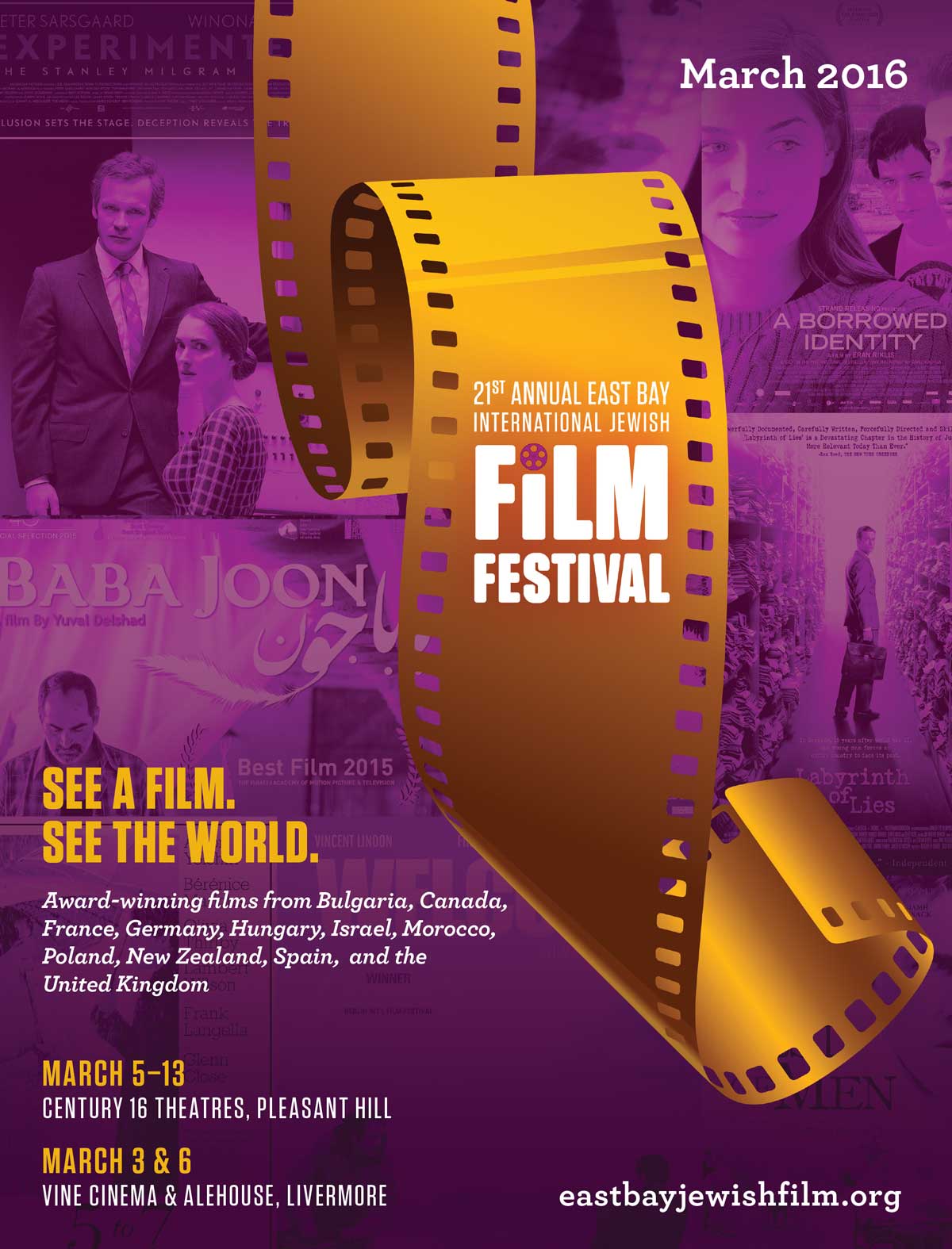
EBIJFF has been through numerous logos over the years, and the fun has always been centered on the festival’s catalogue. We’ve gone through a radical shift in color scheme every year, just to retain the playfulness and eye-catching nature of the designs. Typography has shifted, as well.
Variety.
Entertainment.
Fun!
Was that so hard?
Takeaway:
It's all about people.
Not every project requires a hifalutin concept to fly. Sometimes—often, in fact—it’s more important to focus on what brings joy to the community you’re serving. And it’s a joy as a designer to have a long-term client relationship like this one!