Mangia bene…
Melo’s, a beloved establishment in the East Bay, is family-owned and operated. Their pizza is renowned, and their loyal customer base is a testament to its quality. When an old friend informed me of their plans to open a new location with a unique concept, I eagerly joined the collaboration. Giving a face—type, voice, and color—to their life’s work was an honor.
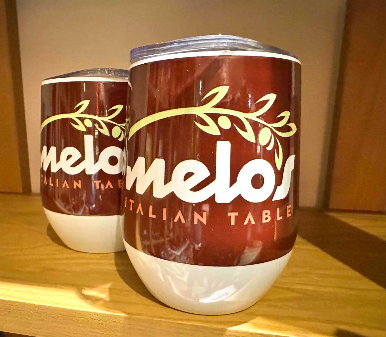
The brand’s visual identity needed to be versatile and effective across any and all mediums, including signage, registers, print collateral, and glassware. It required a distinct look and feel that was vibrant, appetizing, and slightly unconventional: the brand could neither resemble an old-fashioned red-checkered-tablecloth Italian restaurant nor a totally homogenous Italian food chain.
Type & Color
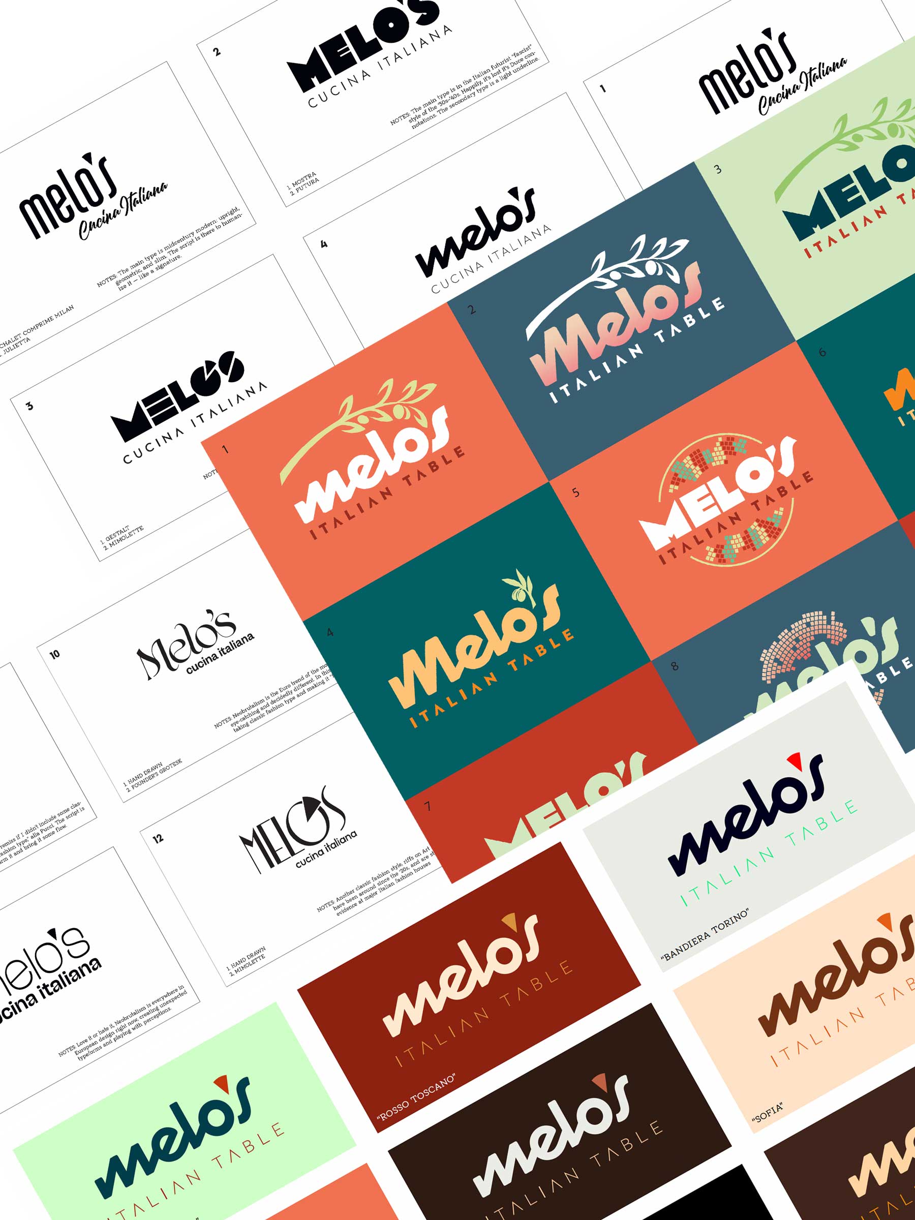
When it came to the type choice, I wanted a geometric design reminiscent of Italian futurism, but with a playful, cursive style.
Since I couldn't find the type I wanted out in the world, I made it.
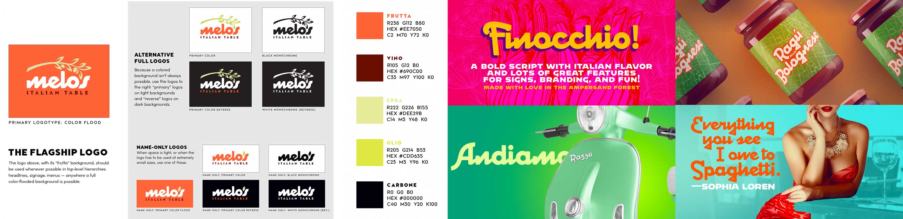
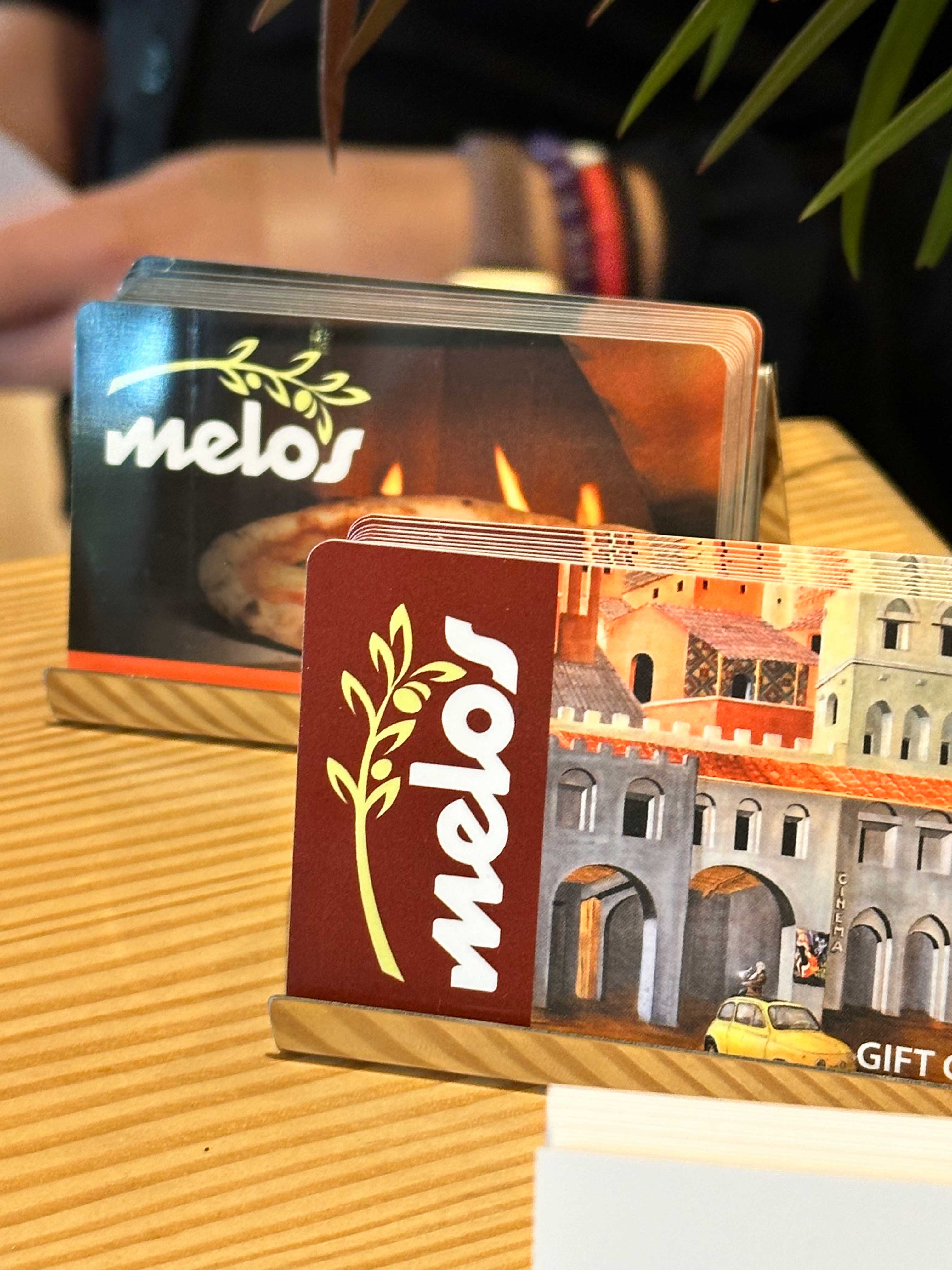
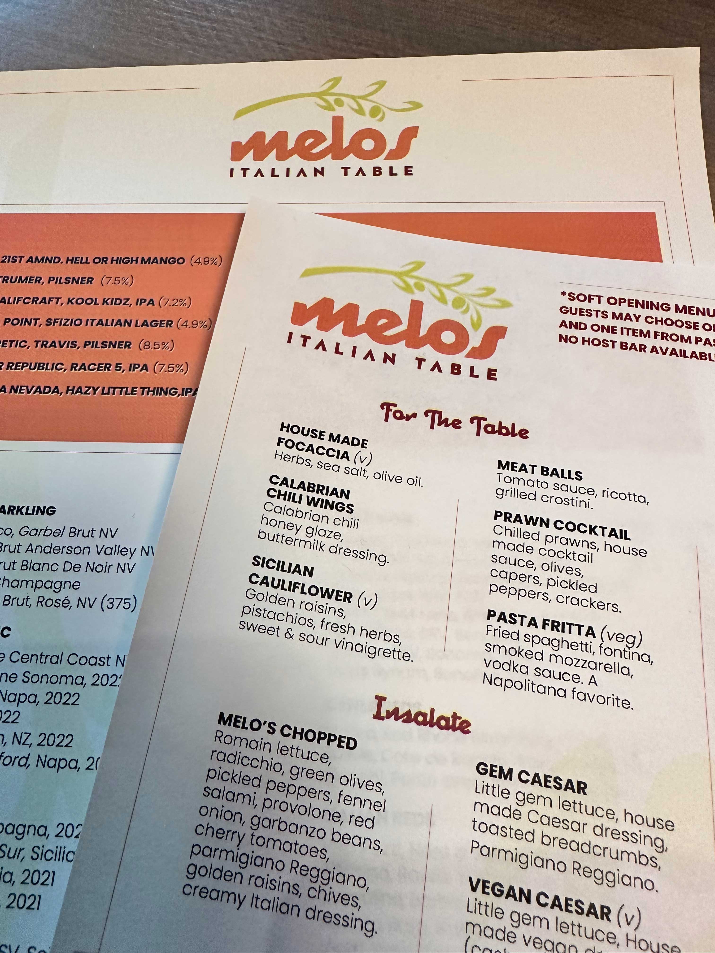
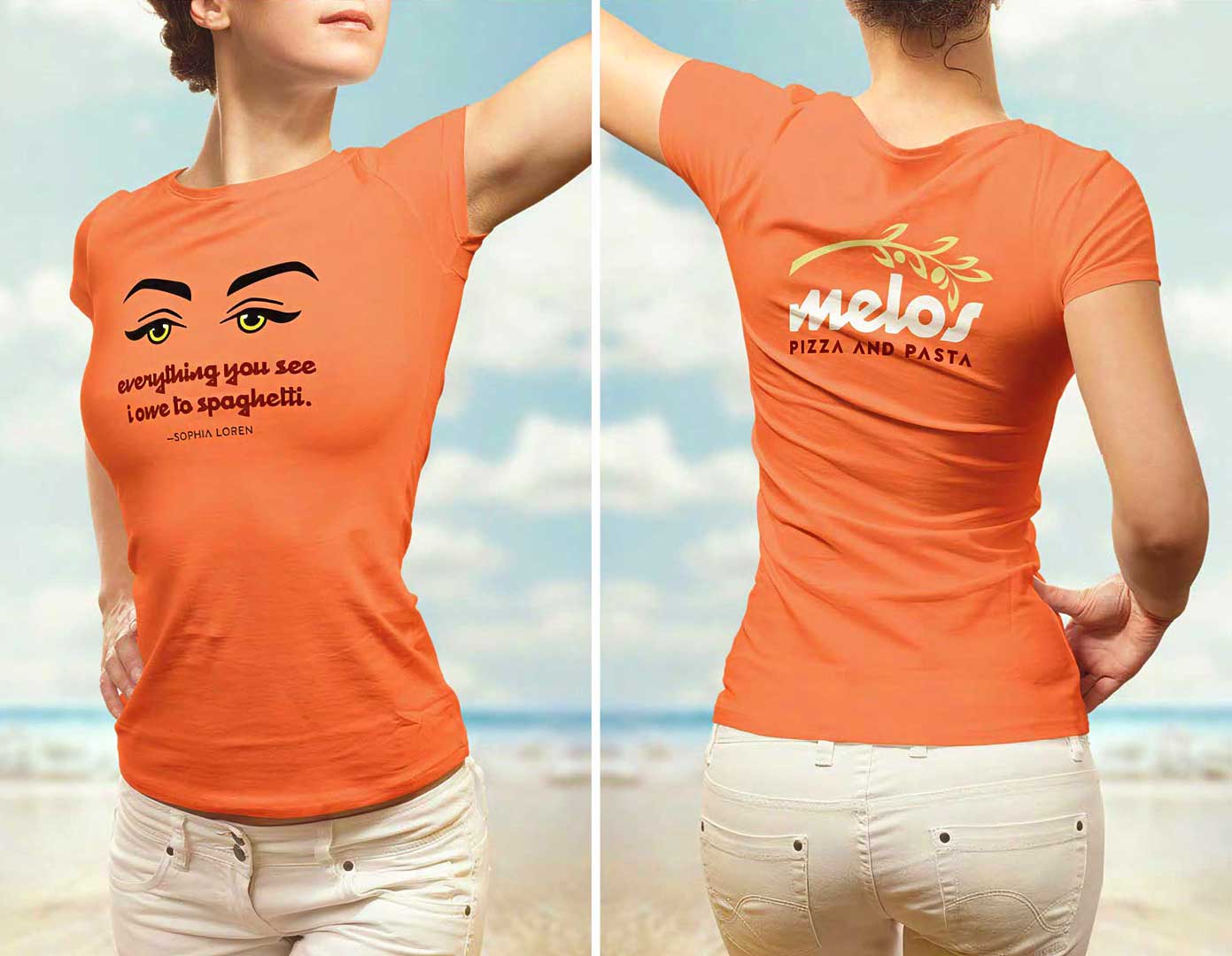
After designing the logo, I expanded it into a font called “Finocchio,” which became the primary typeface for the brand.
Drawing inspiration from new wave cinema, Vespa mopeds, and other hallmarks of Italian midcentury culture, we developed a color language that resonated with everyone involved. These are colors that Sophia Loren and Gina Lolobrigida would be wearing on a beach vacation in Sardegna.
Benvenuto!
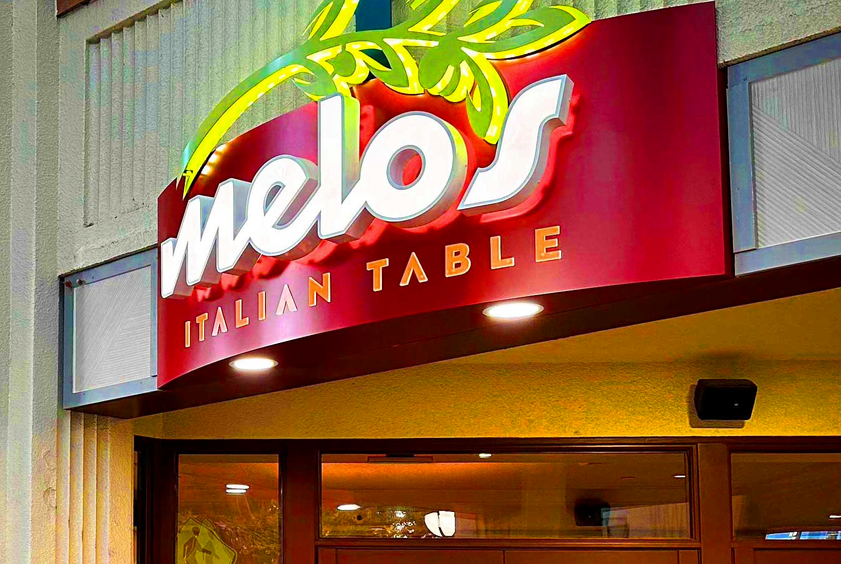
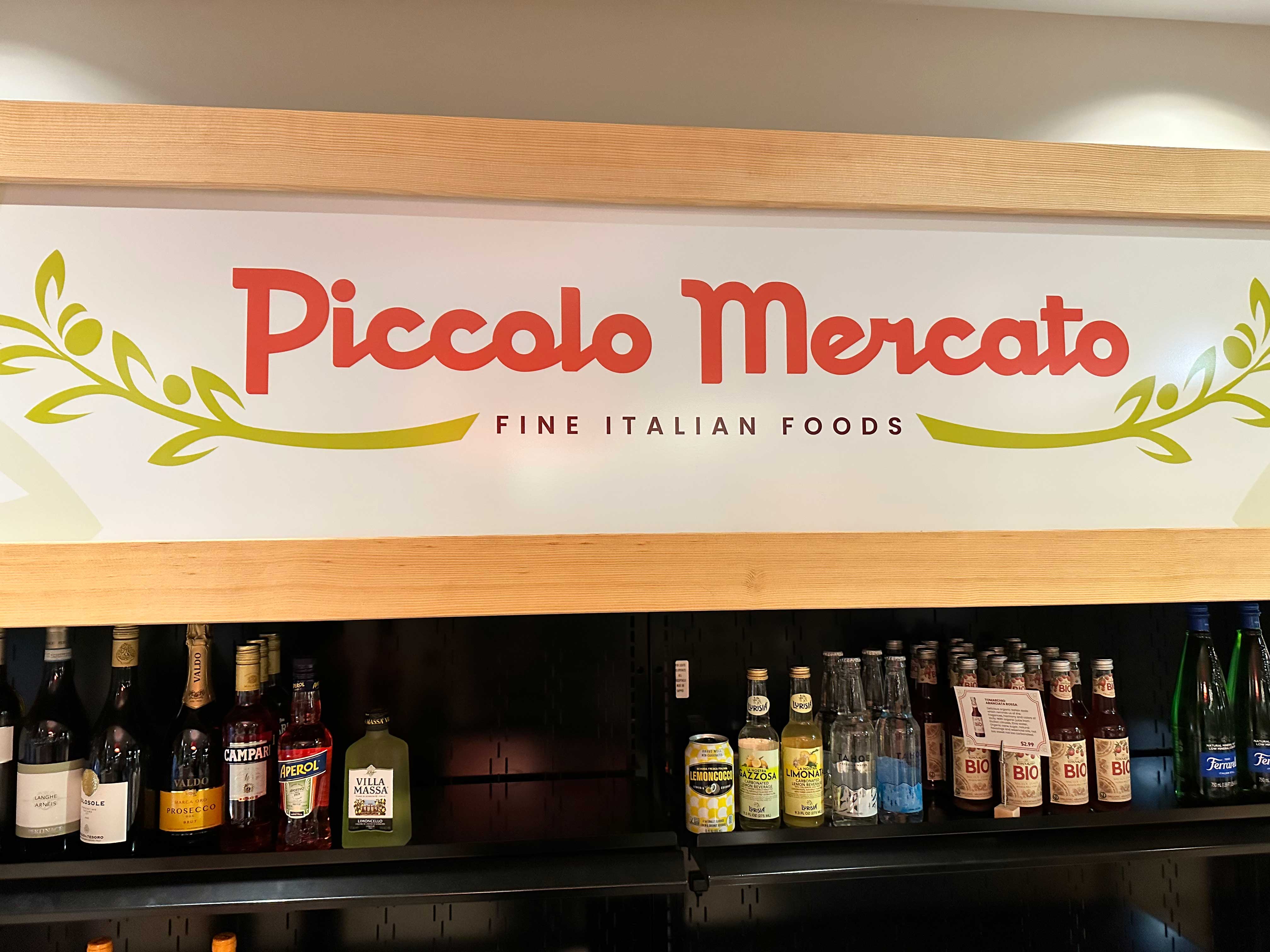
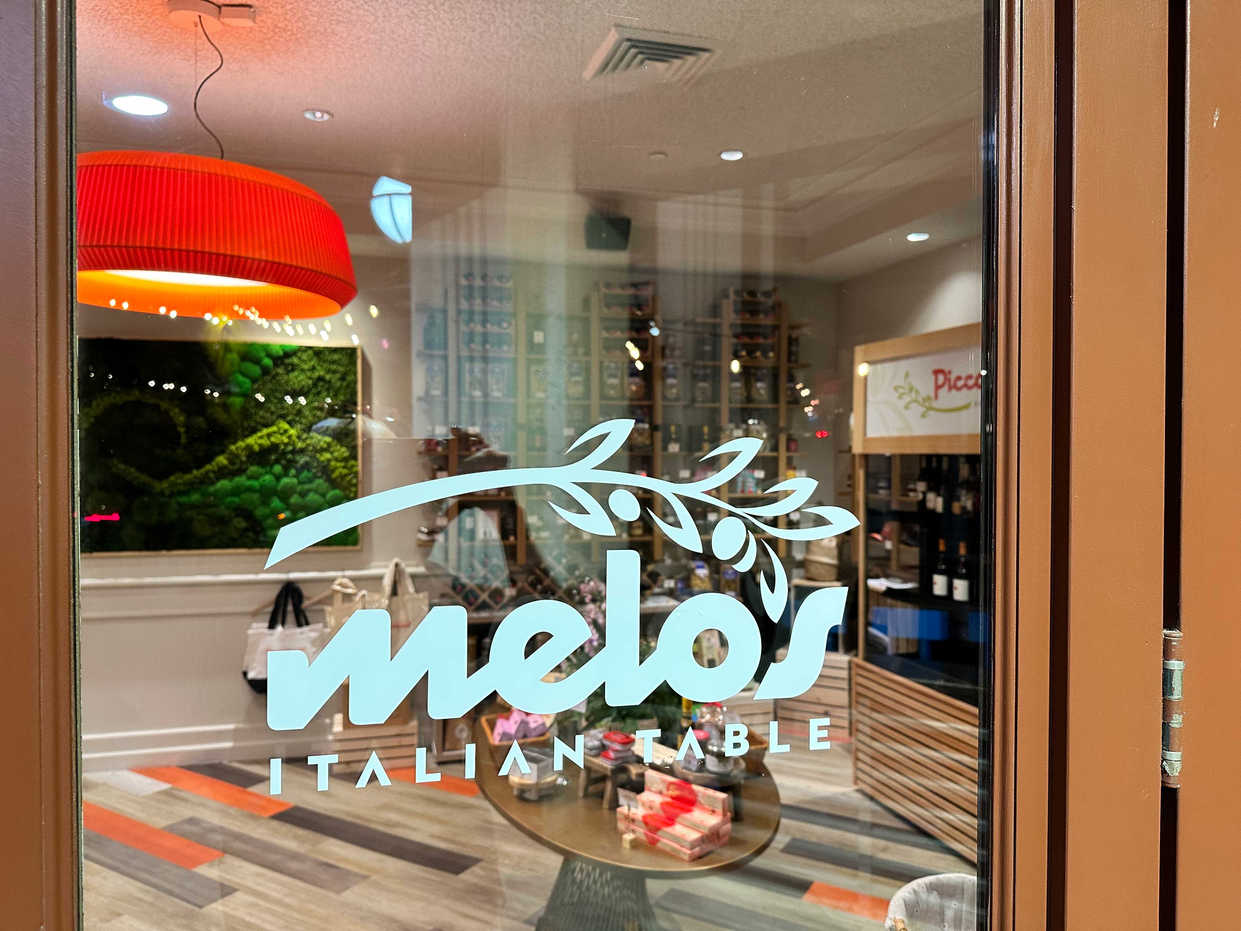
Seeing your work up in lights is always a joy — and Melo’s provided that. Additionally, there is a small market section within the restaurant, and the signage and menus are consistently presented in “Finocchio.”
Visiting Melo’s for their soft opening was an exceptional experience, and the food was truly remarkable. I highly recommend checking it out.