For nearly two decades, I served as the Associate Director of the School of Interaction & UI/UX Design (IxD) at the Academy of Art University in San Francisco. It often surprises people when I tell them how significant my own design work was in my responsibilities.
My tenure at IxD was one of the most fruitful and fulfilling times in my professional life. I had the privilege of guiding thousands of students through the program, watching and shaping the development of their eye, skills, ethical compass, and portfolios, ultimately seeing them through to fantastic careers.It was always about them in the way that any design endeavor must be. I’m very proud of that.
Unusually large scope
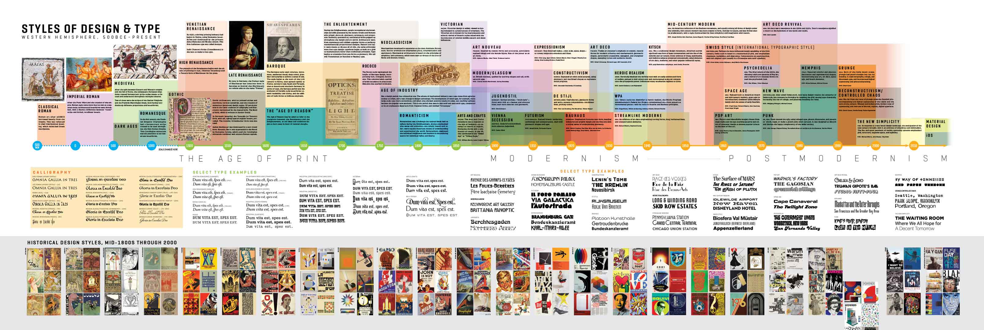
As a director, my duties extended beyond teaching. I was responsible for branding the department, curating the environmental art and signage, and (most importantly) shaping the visual design and typography curriculum for the undergraduate and graduate programs across all media.
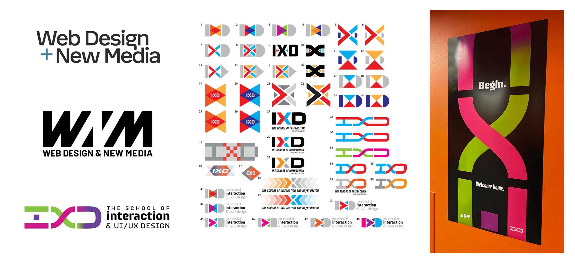
These responsibilities required a substantial amount of active design time, positioning me uniquely to contribute to the department’s development from various perspectives. The requirements for the brand were clearly defined: focus on Human-Computer Interaction, UX Design, Visual Design, and Technology. Utilize structures that convey modernity, cleanliness, and innovation. Establish a distinct identity that sets us apart from the 24-odd schools comprising the expansive AAU.
Branding a school
The new brand’s design had to reflect its core principles. The concept was to emphasize “interaction,” and the explorations eventually led to a product that suggested a fusion of two distinct elements into a third through interaction. The structure was reminiscent of NASA’s iconic “worm logo,” a retro-styled representation of futurism. The typography was entirely custom-designed by me for the department.
The design process, as indicated by the second-round options on the left, involved narrowing down prospective logos until we arrived at the final mark and color scheme.
Since our sister school, the School of Advertising, utilized the first half of the rainbow in its branding (red, red-orange, and yellow-orange), I opted for the latter half for ours (green, indigo, magenta).
The type is custom: a modular face that I designed specifically for the department, the text version of which became my font Gorgonzola Gothic.
Designing a learning space
One of my favorite parts of the job was creating an environment that put the focus squarely on the students and their work. This was way more than decoration—it was about creating an energetic, motivated learning space for the students. It focused on four crucial aspects:
Getting students the information they needed on a daily basis, from maps of the floor to curriculum infographics to (eventually) Covid protocols.
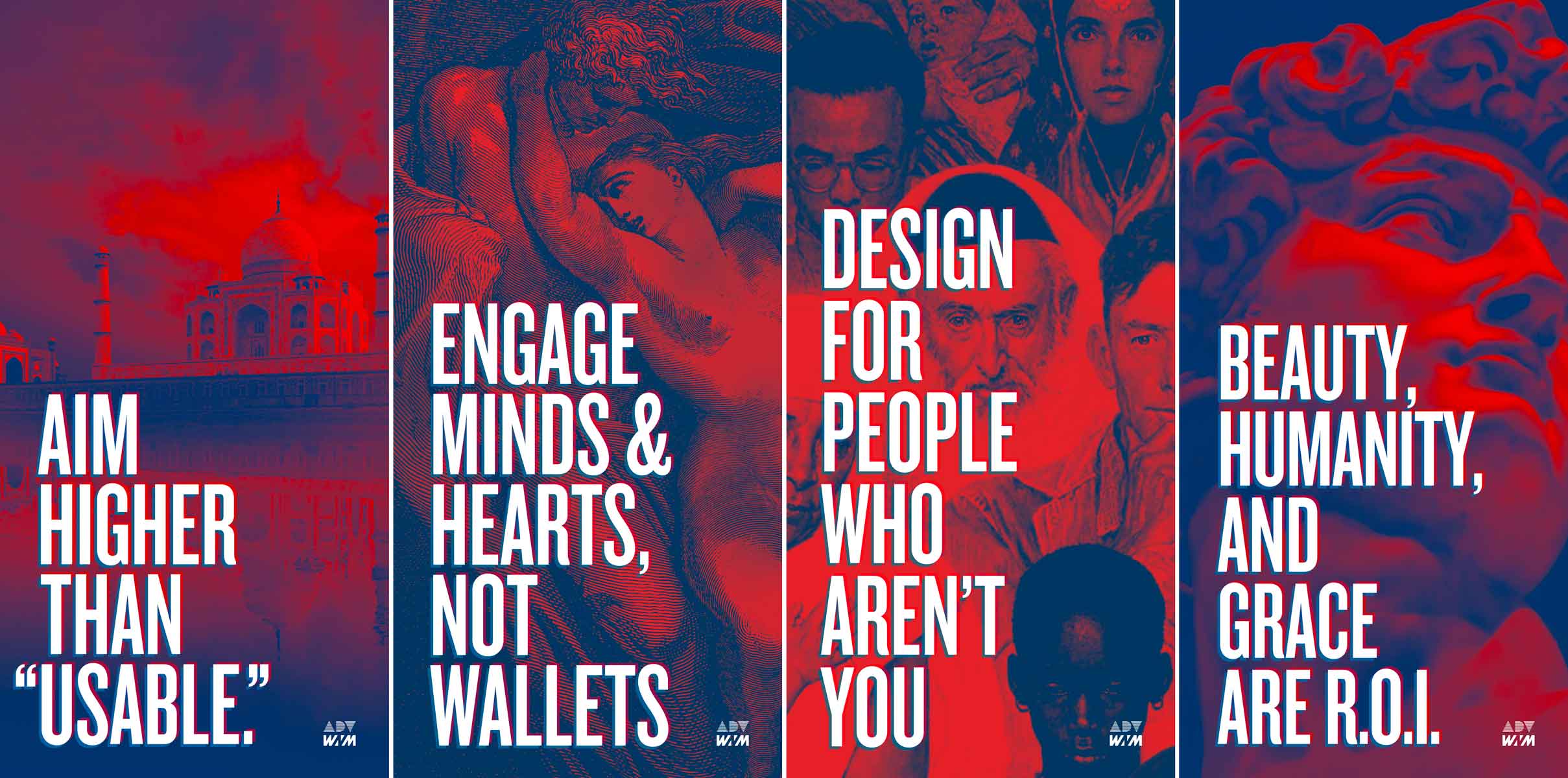
Inspiring students to look to the past as well as the future, and to think of design in a more human-centered way. Many students enter the program thinking of Interaction Design as a moneymaking venture. I wanted to establish a departmental ethos of service and even humanitarianism.
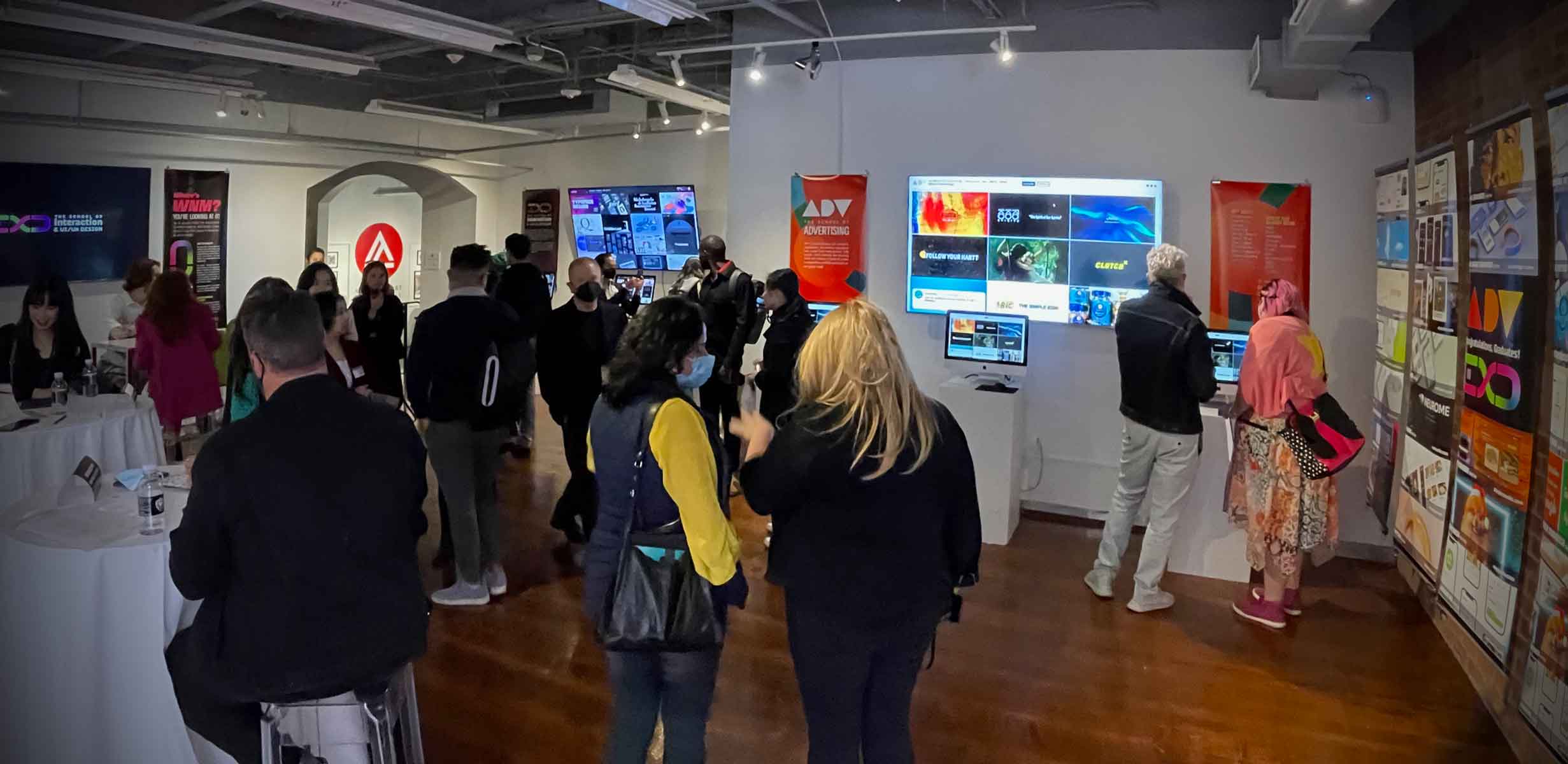
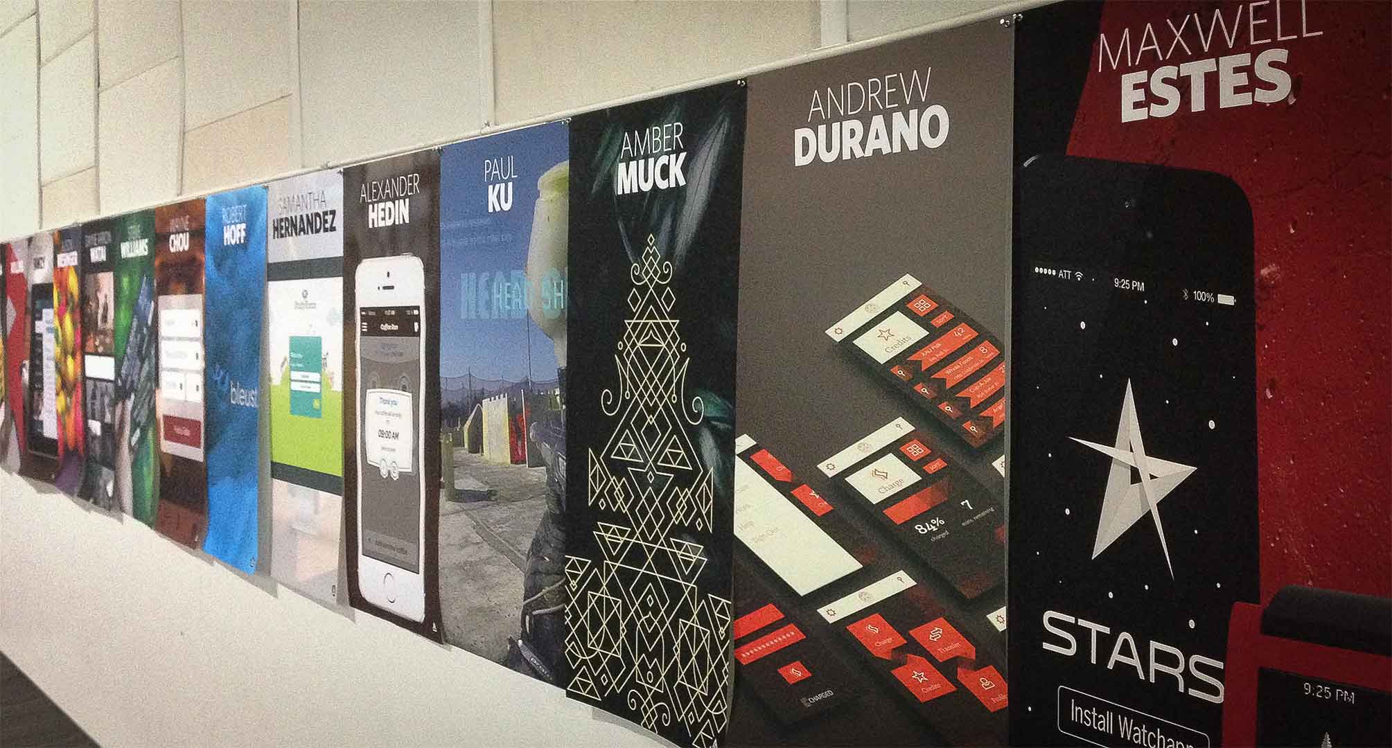
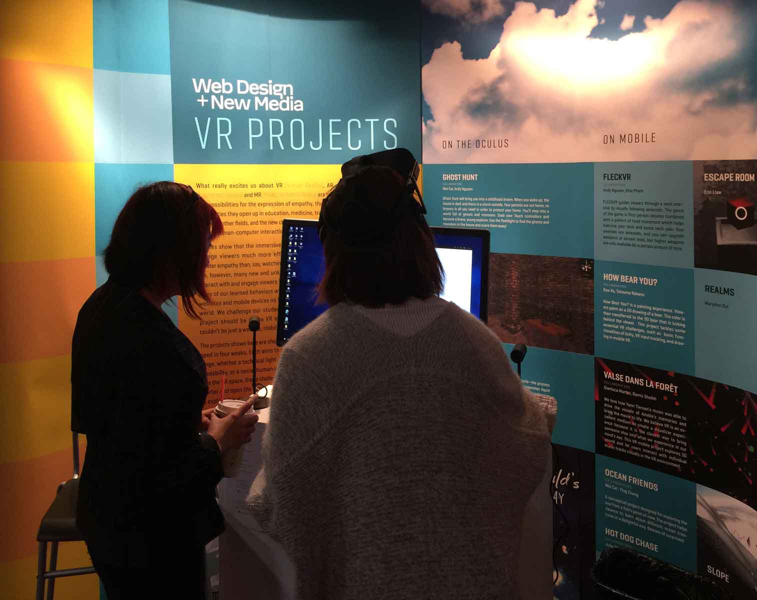
Showcasing student work, both to inspire future students and to encourage enrollment. Coordinating gallery design with onsite campus tours gave tour guides a way of defining the focus of the department (which many found difficult to differentiate from, say, Graphic Design) through the work.
Bringing in the industry to portfolio review events every semester, so that students constantly received professional feedback about their work.
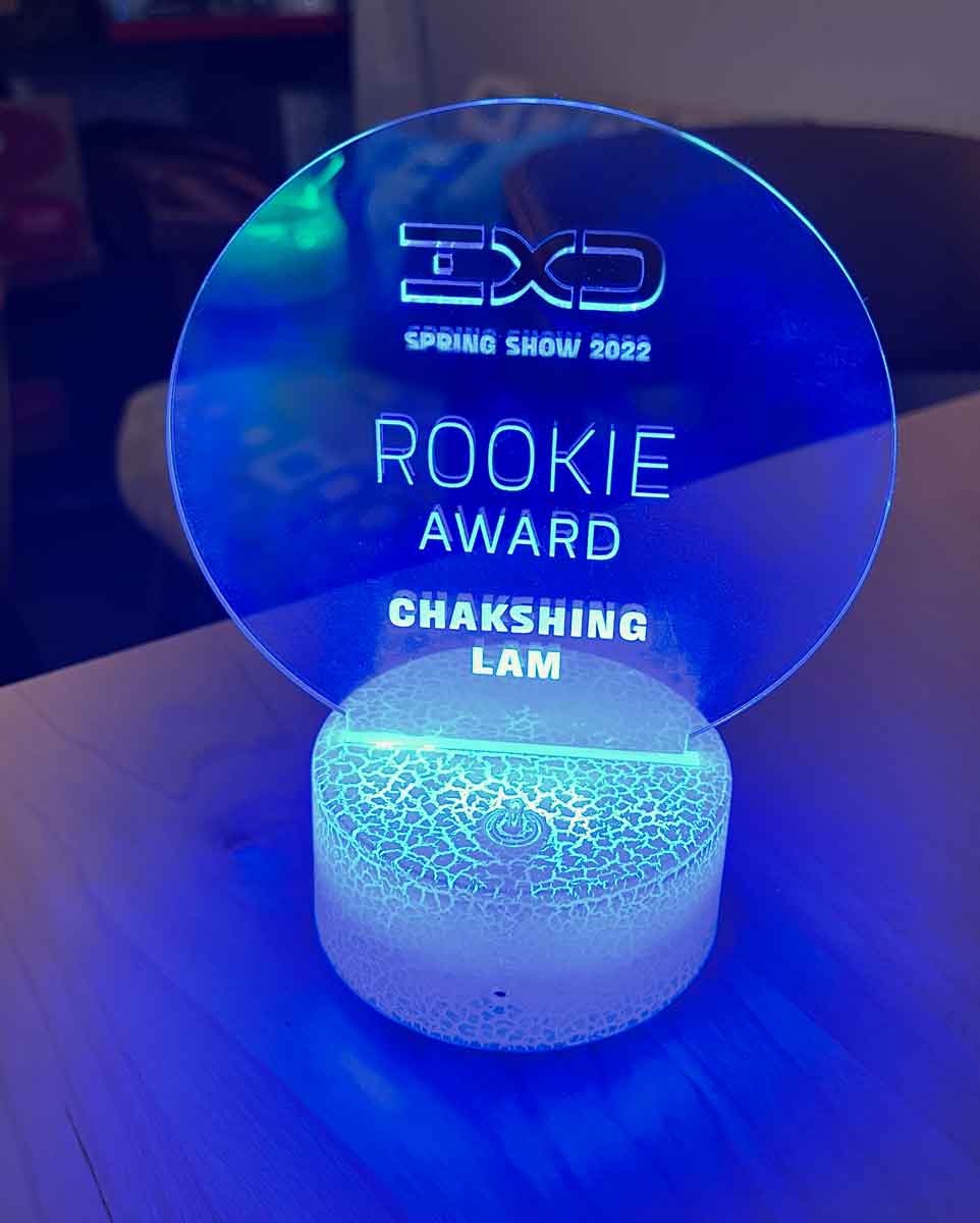
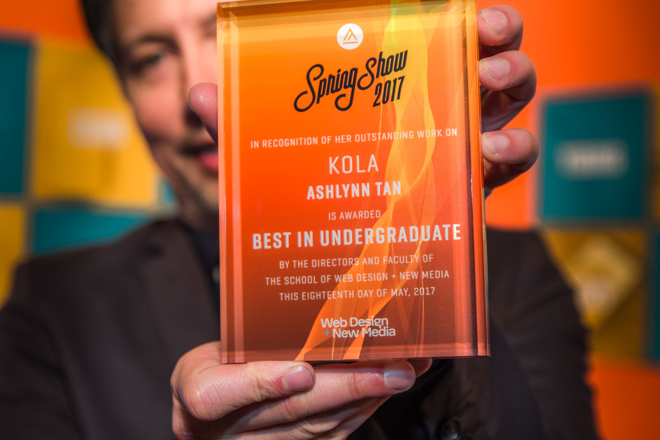
I created all graphic materials, collateral, and imagery for the School of IxD, from signage to social media graphics to the visuals and awards we gave out every year at our annual Spring Show.
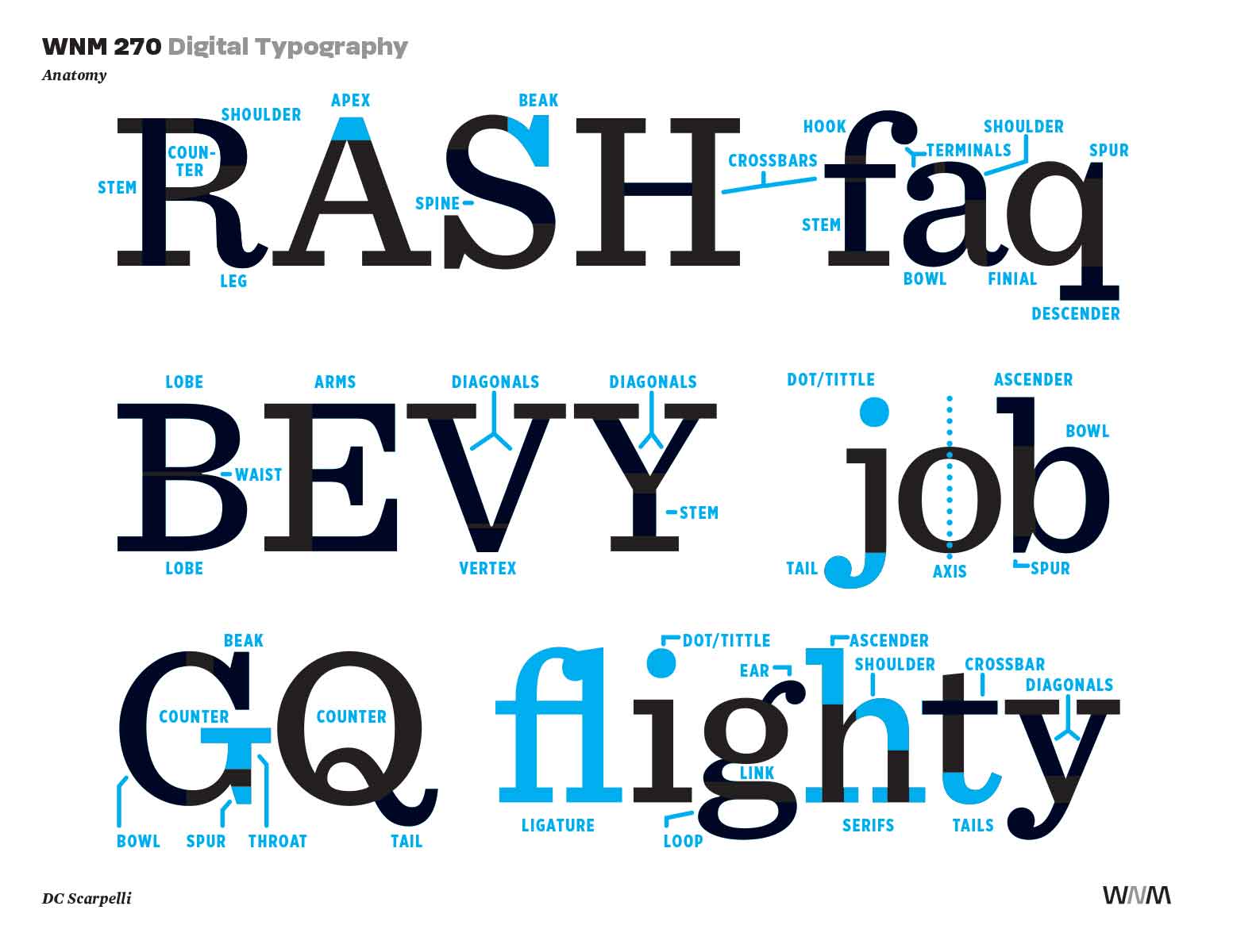
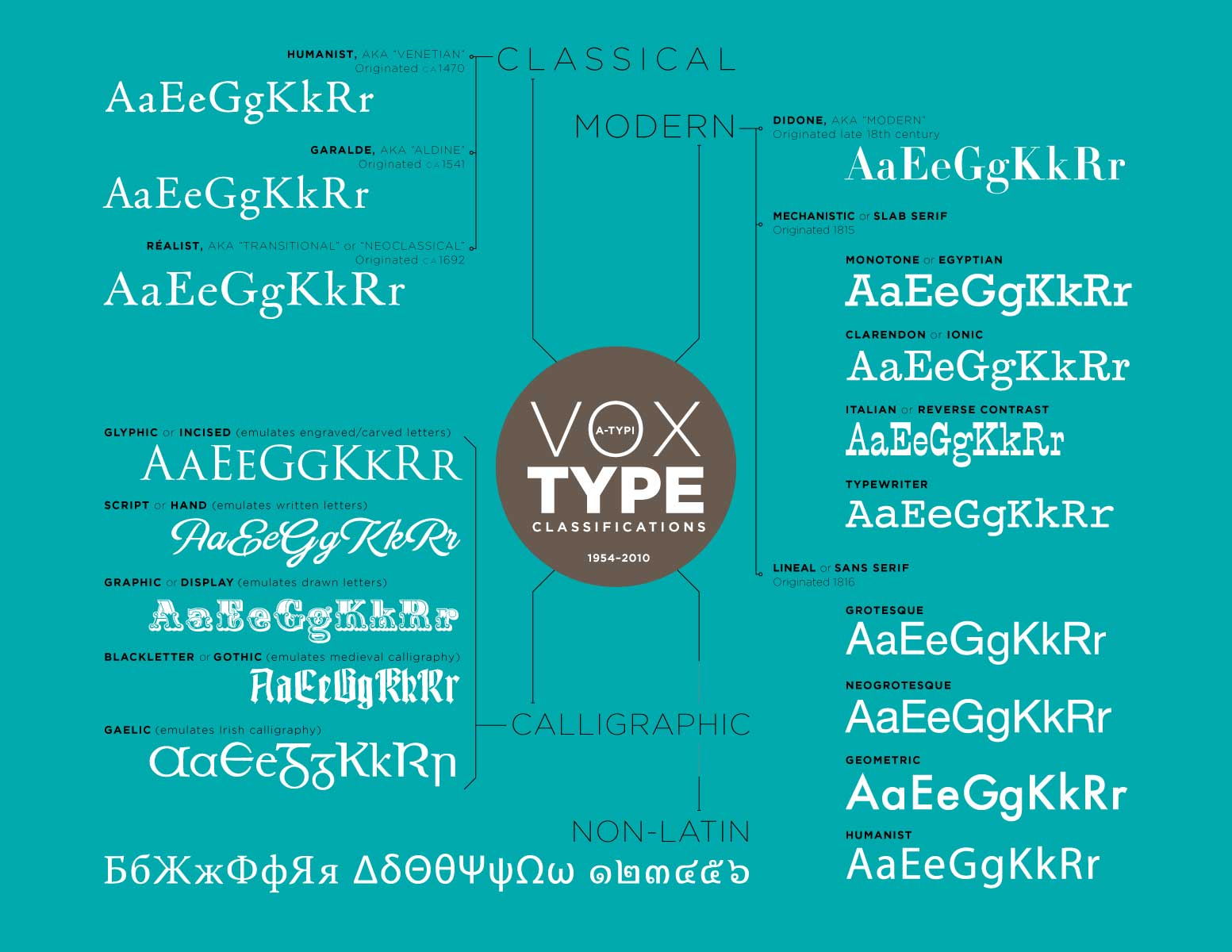
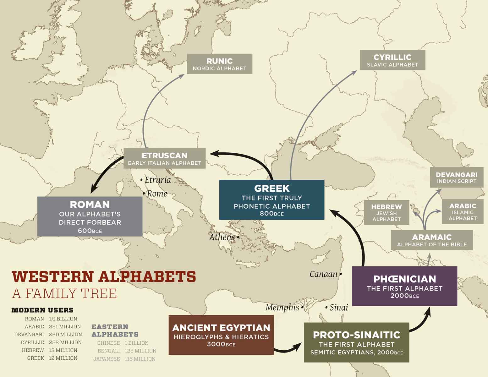
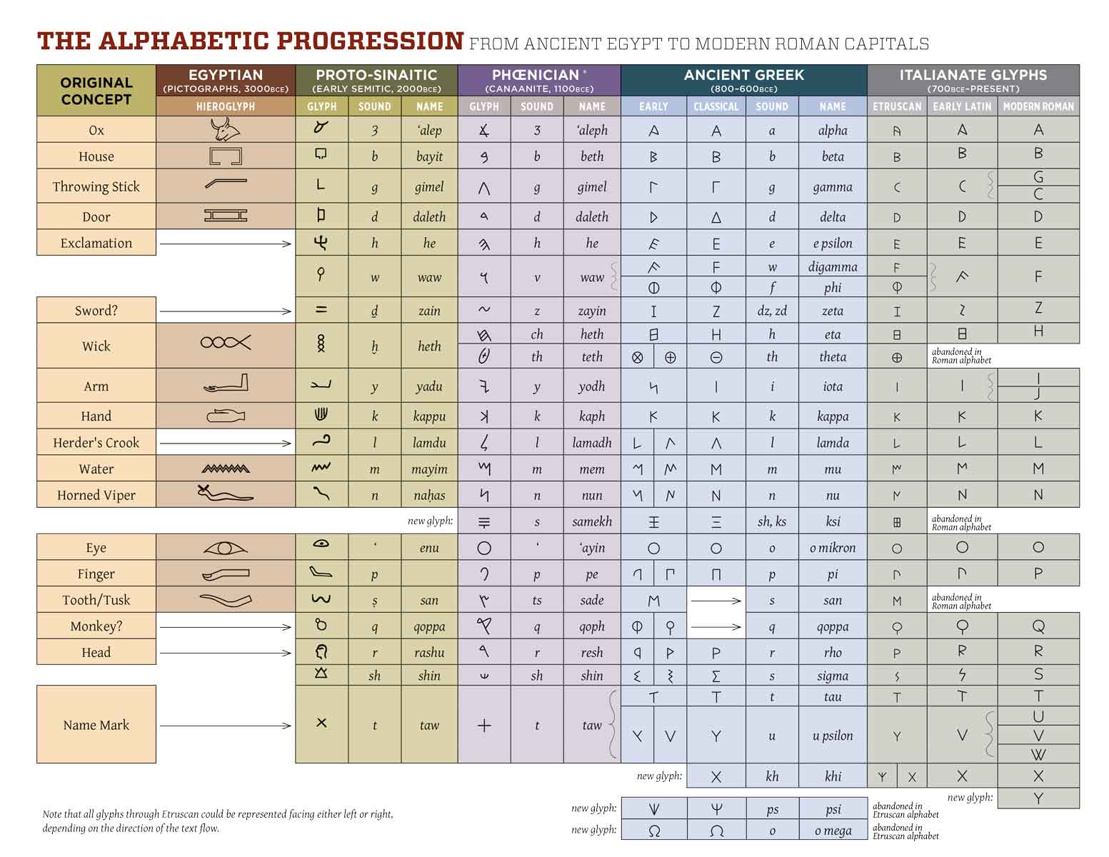
Most importantly, there was coursebuilding. This involved not only shaping the arc of the visual design curriculum, but actually building the majority of the visual design courses, from introductory-level through to senior-level classes, for the BFA, MA, and MFA programs alike, onsite and online. I built the Visual Design & Typography courses from the ground up: all the text, all the graphics, all the videos.
Coursebuilding was profoundly fulfilling. When you build a course in visual design, you have to show all the elements and principles you're trying to convey in the course design itself: when you're asking a student to learn good design, you have to put your money where your mouth is.

-2.jpg)